
Your first analysis in MathJet®
30 minutes · For new MathJet users. No prior experience required.
This tutorial is thirty minutes built around a question: what does a spreadsheet-and-chart program do that Excel doesn’t? You’ll load one hundred days of weather data, plot them inside the worksheet with two series at very different scales, navigate the chart with the mouse wheel, maximize, split, and pin it, and edit the underlying data three different ways — by typing in cells, by dragging points on the chart, and by drawing a curve on a tiny preview plot. By the end you’ll have used MathJet capabilities you won’t find in Excel, including the foundation of everything else MathJet does: live linking that runs in every direction, with no refresh step between them.
Before you start
Section titled “Before you start”- Install MathJet. Download the installer for your platform.
- No prior MathJet experience required. Basic familiarity with spreadsheets helps — if you’ve ever dragged a fill handle or written
=AVERAGE(), you’re ready.
Step 1: Open MathJet and insert a worksheet
Section titled “Step 1: Open MathJet and insert a worksheet”Launch MathJet. An empty workspace appears automatically — MathJet creates one on launch if no other is open, so there’s no “New workspace” button to click. The window shows the empty workspace area in the center, an Environment Pane docked on the right (where any variables you create will appear), and a Command Editor docked at the bottom (where you can type commands in any of MathJet’s supported languages).
Unlike Excel, MathJet doesn’t drop you into a blank worksheet by default. A workspace can hold many worksheets, chart sheets, and other surfaces; you decide which ones to add. To start with a worksheet, use the menu File → New → Worksheet (or its toolbar button, or click the New tab on the tab bar). A blank worksheet opens.
A workspace is the unit of saving in MathJet. Everything you do in the next thirty minutes — the data you generate, the formula you write, the chart you create — lives inside this single workspace and saves together as one .mjw file.
A note on docked panes. Several of MathJet’s panes can share the same dock area, in which case only one is visible at a time and the others sit behind it as tabs. If a later step asks you to look at a pane and you can’t see it, find its tab title in the dock area and click to bring it forward.
Step 2: Load the sample data
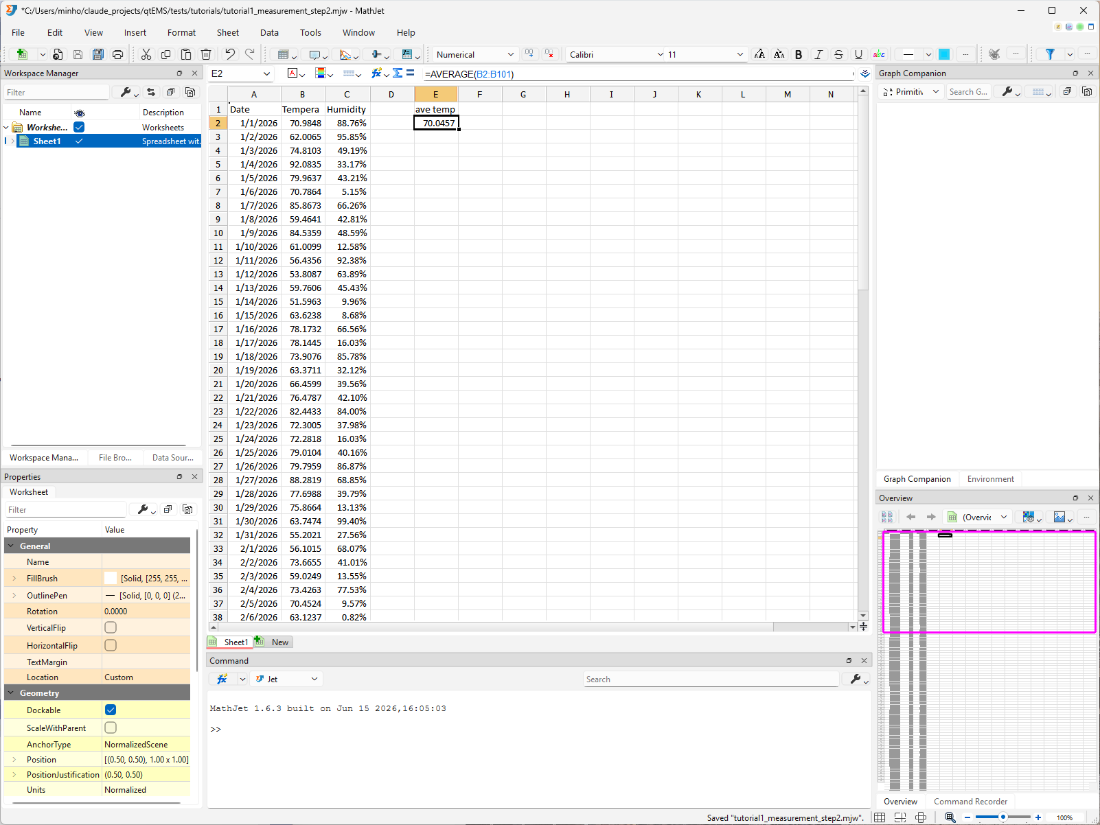
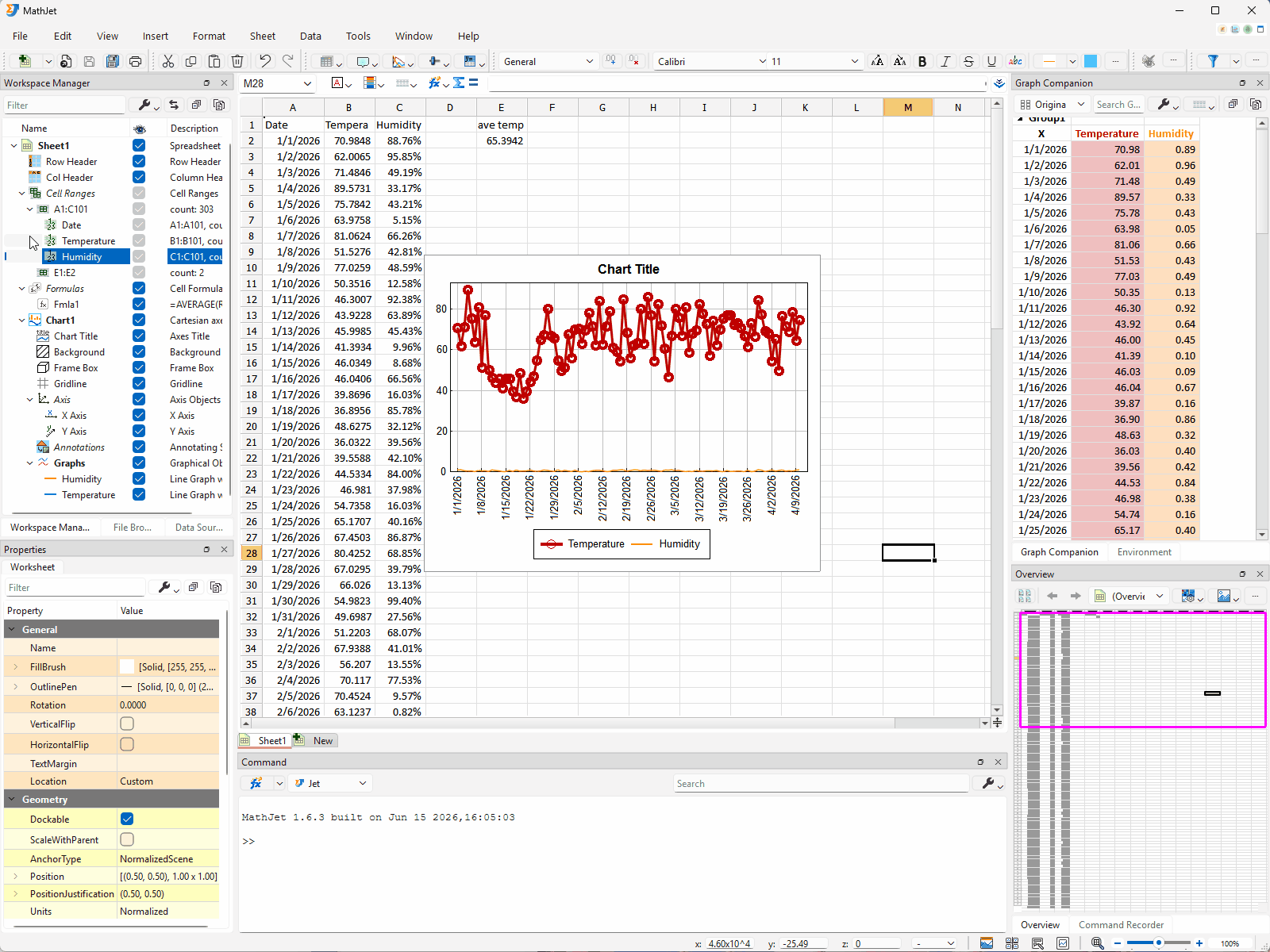
Section titled “Step 2: Load the sample data”Download weather.csv and save it somewhere you’ll find it. The file has three columns — Date (100 sequential days starting January 1, 2026), Temperature (normally-distributed values around 70), and Humidity (uniformly-distributed values between 0 and 1) — with one header row and 100 data rows.
Drag weather.csv from your file manager onto the blank worksheet. MathJet loads the CSV and populates columns A, B, and C with the three data columns. (You can also use File → Open and select the CSV, but drag-and-drop is faster and lets you keep the workspace visible as the data lands.)
If the dates appear truncated as ######## — the column is narrower than the text — double-click the boundary line between the A and B column headers. Column A widens to fit the longest entry (the same trick works on any column you ever need to auto-fit).
Format column C as a percentage. Humidity is conventionally displayed as a percentage rather than a 0–1 decimal. Click the column-C header to select the whole column (or select C2:C101 directly), then click the % button on the toolbar. The cells’ display format changes — values display with two decimal places followed by %: a value of 0.5274 now reads 52.74%. The underlying values are still 0–1 floats; only the display changes. In Step 7 you’ll see this format propagate to the chart’s y-axis tick labels in the split view.
You now have three data columns: 100 dates in A, 100 temperatures in B, and 100 humidity values in C (displayed as percentages). The data is ready for a chart.
Want to generate your own test data instead? MathJet’s Fill Function dialog lets you populate a column from any of the standard statistical distributions — normal, uniform, exponential, Poisson, and more — in a single fill-handle drag. See Generating test data with Fill Function in worksheets for a hands-on walkthrough.
Step 3: Compute the average with an Excel formula
Section titled “Step 3: Compute the average with an Excel formula”Click E1, type Ave Temp, and press Enter. The cursor moves to E2. (Column D is intentionally left empty as a separator between the three data columns and this formula — you’ll see why in Step 12, when the Workspace Manager auto-detects cell ranges and the empty column keeps the data ranges from being merged with adjacent formula cells.)
Type =AVERAGE(B2:B101) and press Enter.
E2 shows the mean of the one hundred temperature values — somewhere close to 70, with random variation depending on which sample MathJet’s RNG drew.
This is a familiar Excel formula in a familiar cell. The point of including it isn’t to teach =AVERAGE — you already know it. The point is to set up the live-linking moment in Step 9: E2 reads from B2:B101, the chart you’re about to create reads from B2:B101 and C2:C101, and when you change a cell, the formula and the chart will update at the same time.
Step 4: Plot the data — chart inside the worksheet
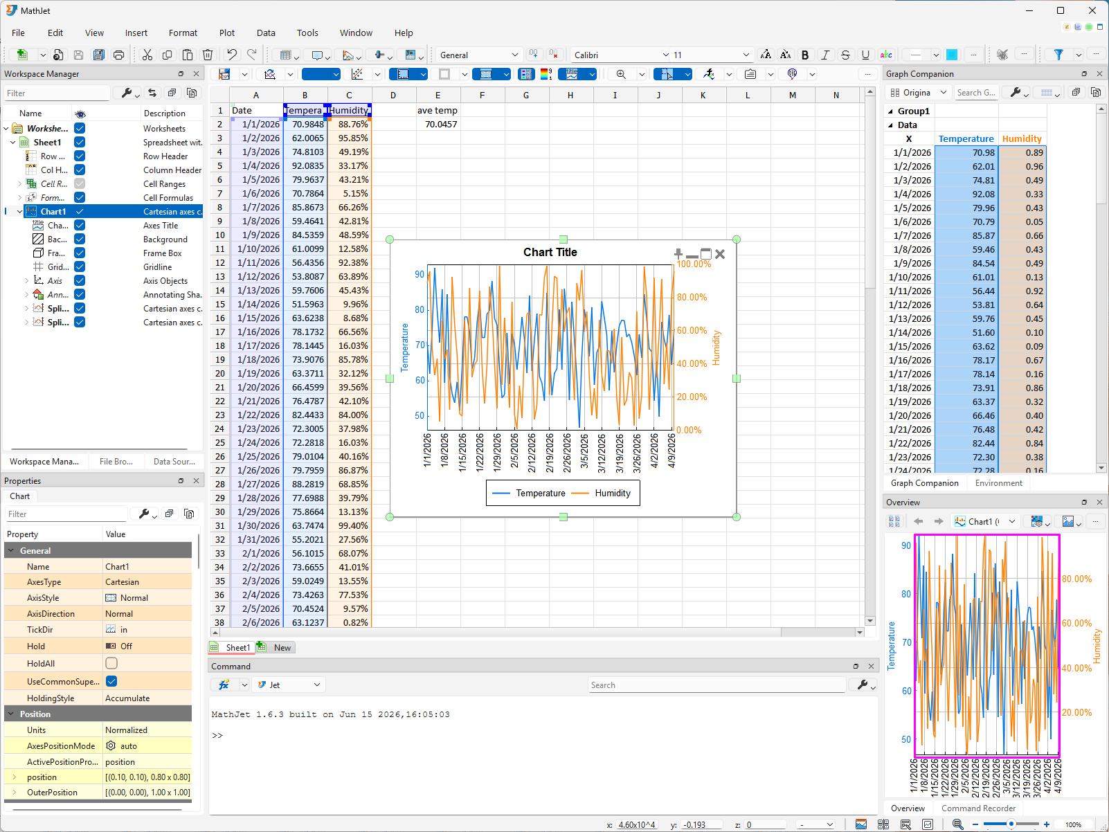
Section titled “Step 4: Plot the data — chart inside the worksheet”Select all three data columns. The fastest way is to click and drag across the column headers: click the column-A header, hold the mouse button down, drag across the column-B and column-C headers, then release. All three columns highlight from header to last data row.
With the data selected, choose Insert → Chart → Line Graph → 2D Line from the main menu. Or — usually faster — click the Insert Chart tool button on the toolbar; the Insert Chart Tool Pane opens with thumbnails of every available graph and chart type. Pick 2D Line Graph from the pane.
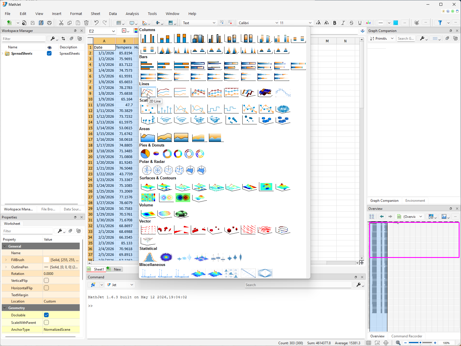
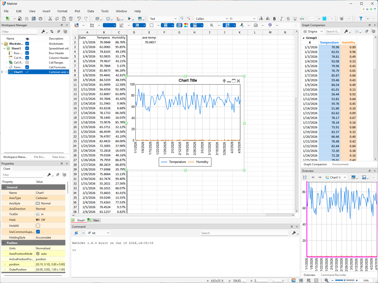
A chart appears inside the worksheet itself, floating over the cell area. This is MathJet’s default placement: a chart belongs in the worksheet that produced it, where you can see the data, the formulas, and the visualization without switching contexts.
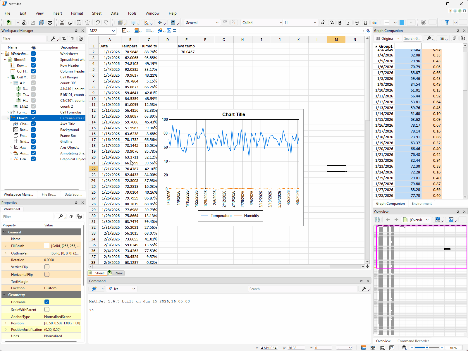
The chart has two line graphs: temperature against date and humidity against date. Because the first selected column holds dates, MathJet automatically treats it as the x-axis, plotting the other two columns (Temperature in B, Humidity in C) as y-values against that shared x. Both lines share the same horizontal axis (dates), but their vertical scales are very different — temperature in the 50–90 range, humidity between 0% and 100% (the percentage format you applied in Step 2). On a single shared y-axis the humidity line will look nearly flat near the bottom of the chart while the temperature line varies in the upper region.
When a shared axis carries both a plain-number series and a percentage-formatted series, MathJet falls back to plain numerical tick labels — you’ll see y-axis ticks like 20, 40, 60, 80 rather than percent signs. The percentage labels return once you split the chart in Step 6.
Step 5: Maximize and restore the chart
Section titled “Step 5: Maximize and restore the chart”Click anywhere inside the chart. A row of four semi-transparent buttons appears in the top-right corner inside the chart — these are the chart’s window-management actions, only shown when the chart has focus. From left to right, the four buttons are Pin, Minimize, Maximize, and Close. Minimize and Close behave the way you’d expect; this step covers Maximize and Restore, and Step 8 returns to Pin.
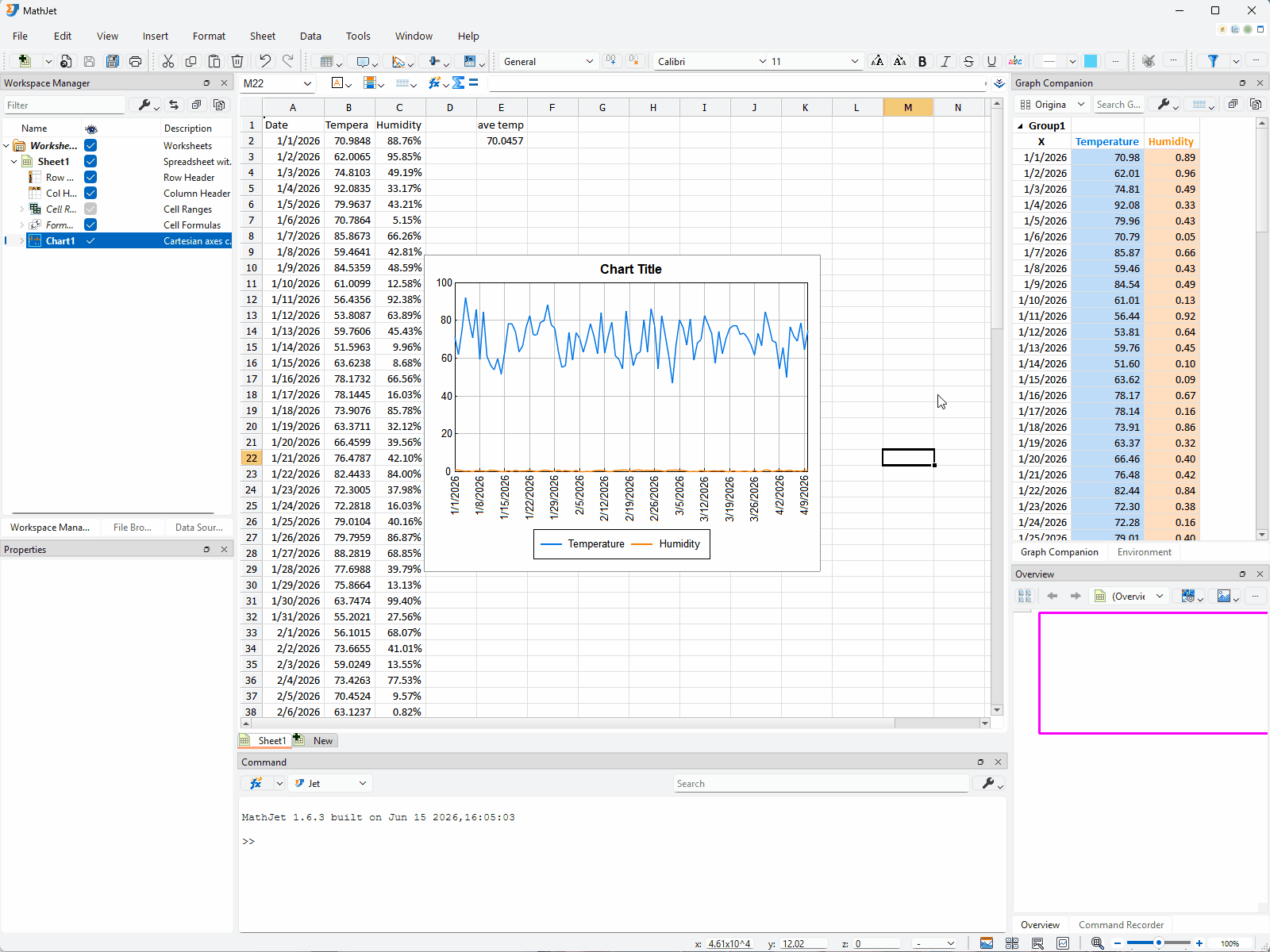
Click the Maximize button. The chart enlarges to fill the entire worksheet area, hiding the cells behind it. This is a much better view for reading the chart — and it’s purely a display mode, not a change to the chart’s data or its position in the worksheet.
Click the maximized chart again. This time only a single Restore button appears at the top-right corner — Pin, Minimize, and Close aren’t applicable while the chart is maximized, so they’re hidden. Click Restore. The chart shrinks back to its original floating position over the cell area, and the cells reappear around it.
The semi-transparent buttons aren’t a power-user toolbar buried under a menu; they’re MathJet’s default chart-action surface, designed to stay out of the way until you click the chart.
Step 6: Split and recombine the chart — three display modes
Section titled “Step 6: Split and recombine the chart — three display modes”The two-very-different-scales problem from Step 4 has two one-click solutions, each useful in a different situation. Both — plus the action to undo them — are exposed on the chart’s toolbar as three actions: Split Chart, Split Axis, and Recombine Graphs. Depending on the toolbar’s available width, the three may appear as individual buttons next to each other, or be tucked into a single dropdown button; either way the actions are the same.
Split Chart (stacked sub-panels). With the chart focused (click it once if focus has moved), click Split Chart (either the button directly or via the dropdown). The chart splits into stacked sub-panels — one panel per series, arranged vertically, top to bottom. Here the chart has two series (temperature and humidity), so you get two sub-panels: temperature on top, humidity below. Each sub-panel shows its series at its own y-axis scale and its own number format — temperature 50–90 range with plain numbers, humidity 0%–100% range formatted as percentages. You can finally see the shape of the humidity data instead of a flat line at the bottom. (Split Chart isn’t limited to two sub-panels: a chart with three or four data series would split into three or four stacked panels by the same rule, one per series.)
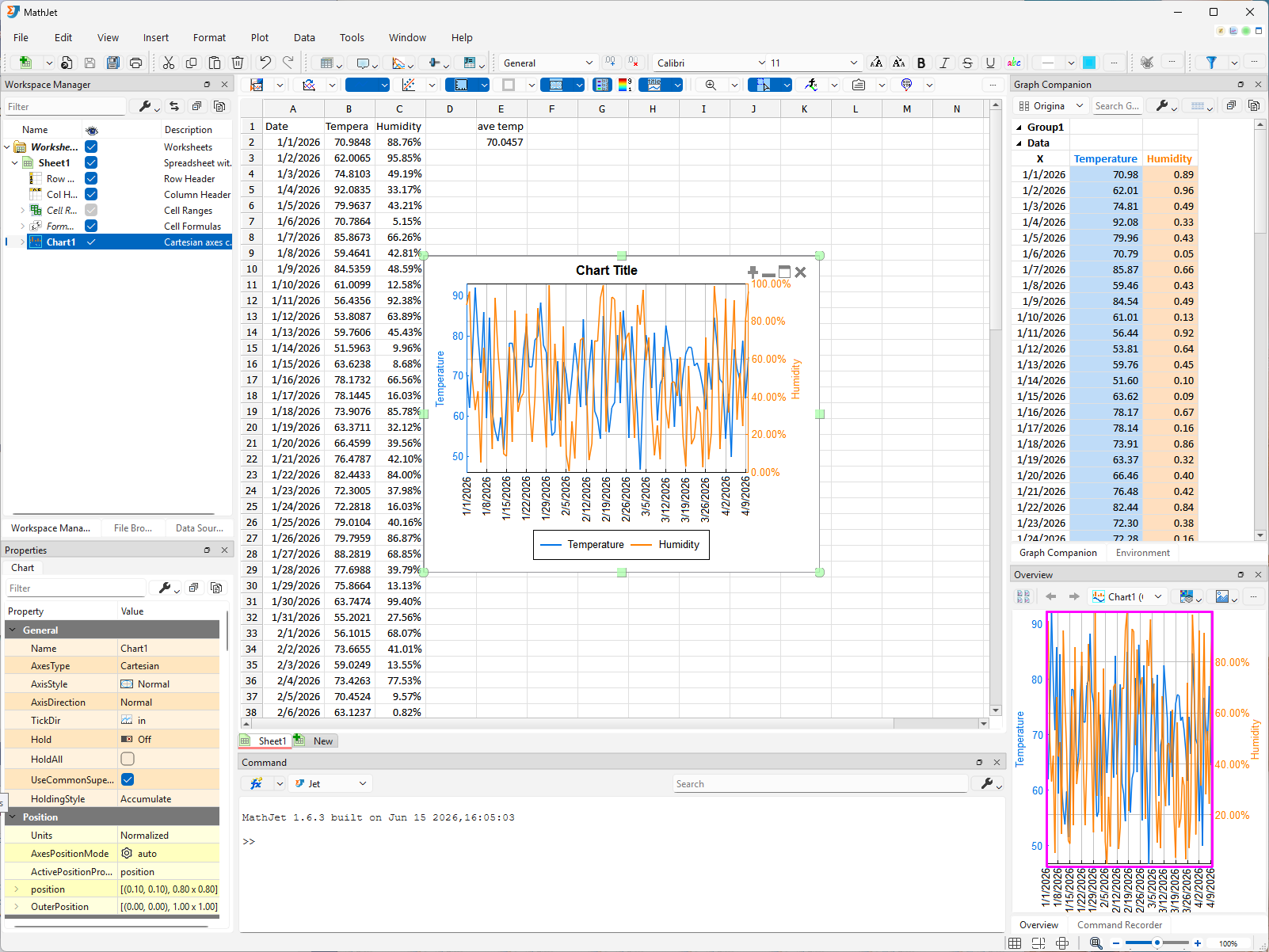
Split Axis (overlapping, YY-plot style). Click Recombine Graphs to restore the combined view, then click Split Axis. This time, instead of stacked sub-panels, both line graphs share the same plot area — but each gets its own y-axis, scaled independently to fit its data. A second y-axis appears on the right side of the chart, labeled with humidity percentages; the original left axis stays labeled with temperature numbers. Both lines now traverse the full width of the chart, and both fill the visible height — the temperature line uses the left axis’s 50–90 scale, the humidity line uses the right axis’s 0%–100% scale. This is sometimes called a YY plot, and it’s often the more useful split when you want to see how two series move together over time.
Recombine. From either split mode, click Recombine Graphs to return to the original combined view. The three display modes — combined, split-into-stacked-panels, split-axis-overlapping — are the same chart presented three ways; switch among them mid-analysis without reformatting your data.
The Split family of features is MathJet’s answer to the two series, very different scales problem — a problem most charting tools force you to solve up-front by creating two separate charts (which Split Chart matches, scaling up to as many panels as there are series) or by manually adding a secondary axis (which Split Axis matches). MathJet exposes both as one-click choices on the same chart object.
Step 7: Navigate the chart — zoom, pan, rotate, fit
Section titled “Step 7: Navigate the chart — zoom, pan, rotate, fit”The chart isn’t a static image. It’s an explorable surface. A handful of navigation interactions worth learning right now:
Mouse-wheel zoom. Move your cursor over the plot area of the chart. Scroll the wheel forward — the chart zooms in, centered on where the cursor is. Scroll backward — it zooms out. There’s no Ctrl-scroll modifier required; the plot area treats the wheel as zoom by default.
Shift-drag to pan. Hold the Shift key and drag inside the plot area — the chart pans without zooming. Faster than navigating via the Overview Pane’s rectangle when you want to nudge the view by a small amount.
Alt-drag (or right-drag on Windows) to change the viewing angle. Hold the Alt key and drag inside the plot area to rotate the view. On Windows, you can also click and drag with the right mouse button for the same effect — often more convenient since it doesn’t require a keyboard hand. Every MathJet chart is inherently 3D — even a chart that looks 2D, like this one, has an underlying coordinate system displayed top-down by default. Alt-drag (or right-drag) tilts that view away from straight-down, giving you an angled, pseudo-3D perspective on the data. For explicitly 3D plots, this is the primary gesture for orbiting around the scene.
Overview Pane. As you zoom or pan, watch the Overview Pane docked at the bottom-right of the workspace. When a chart has focus, the pane shows the chart’s full data range at constant scale, with a small rectangle indicating the region currently visible in the main chart. Drag the rectangle to pan, or click anywhere in the overview to jump.
Fit-to-data with f. When you’ve zoomed or panned somewhere and want to return to the default view that shows everything, press f with the chart focused. The view restores to the full data range.
Top-down view with w. If you’ve used Alt-drag and tilted the chart away from straight-down, press w with the chart focused to snap back to the standard top-down (2D-looking) viewing angle. Convenient when Alt-drag has nudged the angle accidentally.
These aren’t power-user features hidden behind menus. They’re MathJet’s default for any chart, because the chart is meant to be navigated, not just viewed. There are several more shortcuts and convenience features beyond the ones above — for the full inventory, see the Viewing section of the visualization reference.
Step 8: The Graph Companion table — selection sync, cell highlighting, and the Pin button
Section titled “Step 8: The Graph Companion table — selection sync, cell highlighting, and the Pin button”Look at the Graph Companion pane docked at the top-right of the workspace. It shows a table with one row per data point: the date (x), the temperature (y₁), and the humidity (y₂) in side-by-side columns. By default, each value column is color-coded to match its line — a lighter version of the line’s color tints the column in light theme, and the line color itself is used as the column’s text color in dark theme. With 100 data points, the table is scrollable; as your eye moves across the chart, you can scroll the table to find the corresponding row.
The companion table isn’t a passive readout. It’s wired to the chart’s selection state — and to the worksheet’s cell selection — so a single selection action propagates through all three views.
Plot → table + cell. Click and drag in the plot area to draw a rectangle around a subset of points — say, the highest five temperature days. As you drag:
- The rows in the companion table corresponding to those points highlight (the table may scroll to bring them into view).
- The corresponding cells in the worksheet (the column B cells for those rows) also highlight.
You’re selecting in the chart, and the selection runs through to two other views simultaneously. Release the mouse and the highlight persists. To clear it later, click anywhere inside the chart’s plot area without dragging — a single click deselects any previously selected points or objects.
Table → plot + cell. Click a cell in the companion table. Selection runs the other direction with the same fidelity, but the scope depends on which column you click in:
- First column (Date — the x-coordinate). Selects the points at that x on both lines simultaneously; the cells in worksheet columns B and C for that row highlight together. Use this when you want everything at one date.
- Temperature column (y₁). Selects a single point on the temperature line only; only the corresponding cell in worksheet column B highlights.
- Humidity column (y₂). Selects a single point on the humidity line only; only the corresponding cell in worksheet column C highlights.
The Pin button. Your worksheet has 100 rows of data. The cell highlighted via your chart-selection might be at row 80 — well below the worksheet’s current scroll position if you’re looking at the top of the data. Manually scrolling the worksheet to find it would be slow. With the chart focused, the semi-transparent button row at the top-right includes the Pin button. Click it. The worksheet automatically scrolls so the selected cell is visible, while the chart stays anchored at its current position. The chart pins your view of the data; the sheet follows.
The Graph Companion table, the cell-selection sync, and the Pin button together turn the chart into a navigable index into the data. There’s no Excel equivalent for any of these capabilities, much less for the combination.
MathJet has additional selection techniques beyond rectangle-drag and table-click — including axis selection, where dragging along an axis line picks out every data point whose coordinate in that dimension falls in the dragged range, and the data-grouping/filtering workflows those selections feed into. Tutorial 6: Interactive plots that explore themselves covers them in depth.
Step 9: Live linking — edit a cell, watch the chart
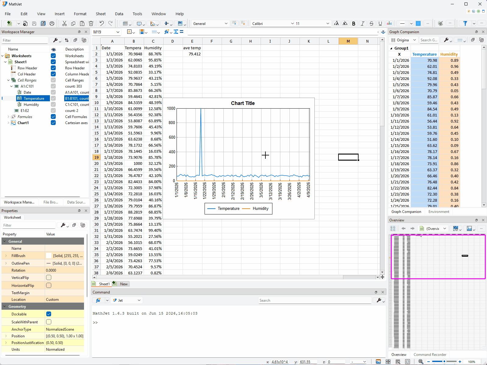
Section titled “Step 9: Live linking — edit a cell, watch the chart”Pick any cell in the temperature column (column B) that’s currently visible — the Pin button from Step 8 may have scrolled the sheet, so use whatever B-column cell is on screen. We’ll use B20 as the running example for the rest of this step; if you picked a different row, mentally substitute that row number wherever B20 appears below.
Note the cell’s current value, then overwrite it with something dramatic — say, 1000 (a temperature far outside the distribution you generated). Press Enter.
Two things happen in the same instant:
- E2’s value updates. The
=AVERAGEformula recomputes; the average jumps by(1000 − 70) / 100 ≈ 9.3. - The chart redraws. The point at row 20 (or whichever row you chose) in the temperature line is now a spike, far above the rest of the data. (If the chart is still in split mode from Step 6, look at the temperature panel; recombine first if you’d rather see both lines together.)
(A quieter third update happens if column B is currently the active selection in the Workspace Manager — the Properties pane at the lower-left recomputes its summary statistics — mean, std dev, min, max — for the new column-B values. You’ll meet the Workspace Manager and Properties pane properly in Step 12, where this same propagation pattern repeats across more panes.)
You didn’t tell the chart to update, you didn’t refresh, you didn’t run anything. The chart was reading from B20; you wrote to B20; the chart redrew on the same line of execution.
This is live linking in the cell-to-chart direction. It’s the foundation of MathJet’s views are fused architecture: cells, charts, and (later) any plot, Environment Pane row, or script reference all read the same array in process memory. There is no copy to keep in sync because there is no copy.
Restore B20 (Ctrl+Z) and the spike disappears as fast as it arrived.
Step 10: Live linking, the other way — data nudging
Section titled “Step 10: Live linking, the other way — data nudging”Live linking also runs in the opposite direction. The chart isn’t just a view of the cells; it’s an editable surface that writes back to them. The feature is called data nudging, and it lets you adjust one point at a time or many points at once with a smooth falloff.
Enter data nudging mode. From the menu, choose Data → Visual Editing → Data Nudging, or click the equivalent toolbar button. The chart enters nudging mode: a semi-transparent circle appears and follows your mouse, snapping to the nearest data point on the chart. When you move the mouse close to the focus of the circle (the snapped marker), the cursor changes shape to two opposing arrows — that’s the signal that you’re on top of a data point and ready to drag.
Nudge a single point. Hover over the B20 marker on the temperature line until the circle snaps to it and the cursor turns to two arrows. Click and hold the left mouse button, then drag up or down slowly. The point moves along as you drag — and at the same time, B20’s value in the worksheet updates in real time, and E2 (the AVERAGE) follows along. Release the mouse to commit the new value.
Nudge many points at once. The circle’s size controls how many points your next drag affects. Hold Shift and scroll the mouse wheel forward — the circle grows. Now click and drag a point at the focus of the enlarged circle, and the points inside the circle all move along — but the magnitude of change falls off with distance from the focus, mirroring the way the circle’s color goes lighter toward its perimeter. In the worksheet, the cells linked to the affected points pick up matching background-color gradients, a visual indicator of how much each cell value changed.
If a nudge wasn’t what you wanted, Ctrl+Z undoes the last drag.
Works in 3D too. Data nudging applies to 3D surface plots as well — click and drag a surface point and the linked cells update the same way the 2D-line cells do here.
Exit data nudging mode. Click the same Data Nudging menu item or toolbar button to toggle off, right-click in the plot area for the context menu and choose the exit item, or press Esc at any time.
This is data nudging. The chart isn’t a downstream rendering of the data; it’s a control surface for it. Because cells and chart points refer to the same values in memory, edits flow either way without a refresh step. Most charting tools stop at the chart updates when the data changes. MathJet’s plot area is the data, presented graphically.
Step 11: Customize the chart’s appearance
Section titled “Step 11: Customize the chart’s appearance”Every visual element in a MathJet chart — graphs, axes, legends, gridlines, text — exposes a set of editable properties controlling its appearance and behavior. MathJet provides several editing surfaces — for example, quick choices from the right-click context menu, live edits in the always-docked Properties pane, and the standalone Edit Properties dialog. We’ll use the first two on the temperature line to give you a feel for the system; the Appearance reference lists the complete set.
Quick edits from the right-click context menu. Right-click directly on the temperature line in the chart. The context menu opens — and at the top, you’ll notice a set of custom submenus surfacing the most-edited properties as one-click choices:
- Hover over Line Width. A submenu lists predefined widths from 1 to 10. Click 3 — the temperature line in the chart thickens instantly.
- Hover over Line Color. A submenu lists commonly used colors. Pick a bold red — the line redraws in red.
- Hover over Line Style to see the solid / dashed / dotted options if you’d like to try one.
That’s the fast path for the most common changes — no dialog, no Apply button, results are visible the moment you click.
Live edits in the Properties pane. Look at the Properties pane docked in the lower-left of the workspace. It’s been there since you launched MathJet, just waiting for an object to be selected. Because the temperature line is currently selected from your right-click, the pane is now showing its full editable property set — every line attribute, marker style, fill option, and behavior toggle the object exposes. Edit a value directly in the pane and the change applies to the selected object the same instant. The Properties pane is the most convenient route for properties that aren’t in the quick context menu, because it’s always already visible — no separate dialog to open.
(For completeness: the context menu’s Edit → Properties item also opens a standalone Edit Properties dialog whose content matches the Properties pane. It’s there if you prefer a separate window, but the pane is usually faster.)
Live propagation to the other panes. As you make property changes, watch the Overview Pane and the Graph Companion table. Any chart change that affects how a data series is drawn — line width, color, marker visibility — propagates immediately to those views as well. The same pattern you saw with cell edits in Step 9 and chart drags in Step 10 extends to appearance edits — change a property in one place, every dependent view follows.
This is the lightest possible introduction to a deep customization surface. MathJet’s appearance system covers — per object — line styles, marker styles, axis tick formats and gridlines, font choices, fill patterns, framing, transparency, and dozens of other attributes. For the full inventory and what each property controls, see the Appearance reference.
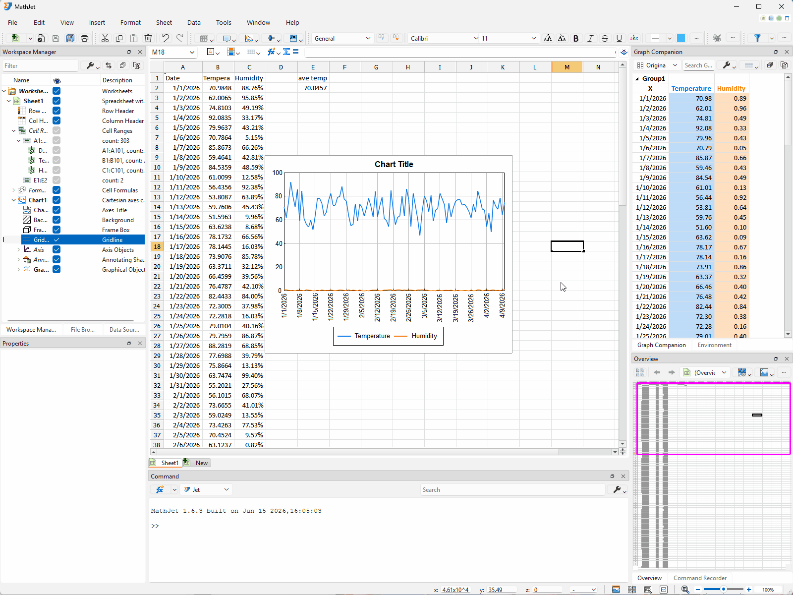
Step 12: Explore — and edit — the data with the Workspace Manager
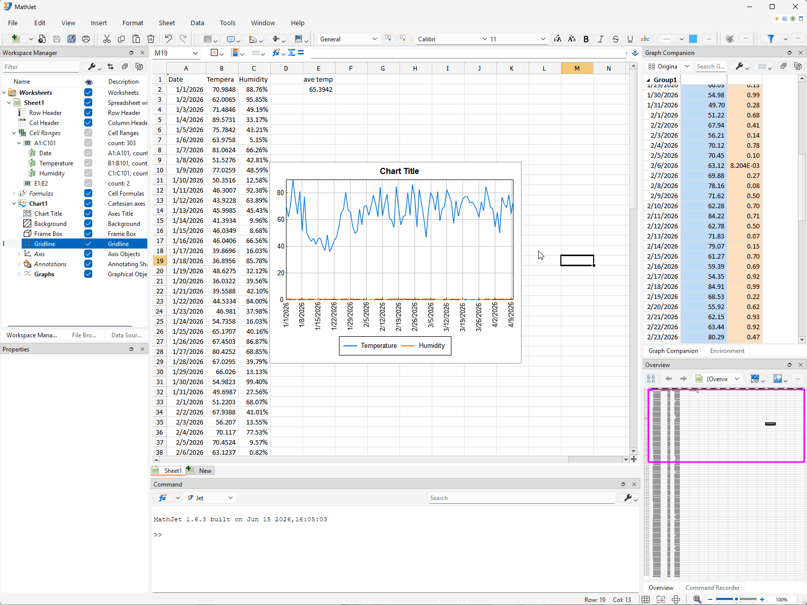
Section titled “Step 12: Explore — and edit — the data with the Workspace Manager”Look at the Workspace Manager pane docked on the upper-left side of the workspace. It shows a tree view of everything in the workspace. By now your tree includes the worksheet you inserted, the data columns, the cell ranges you filled, the chart you created in Step 4, and the formula in E2 — every analytical artifact you’ve produced is a node in this tree.
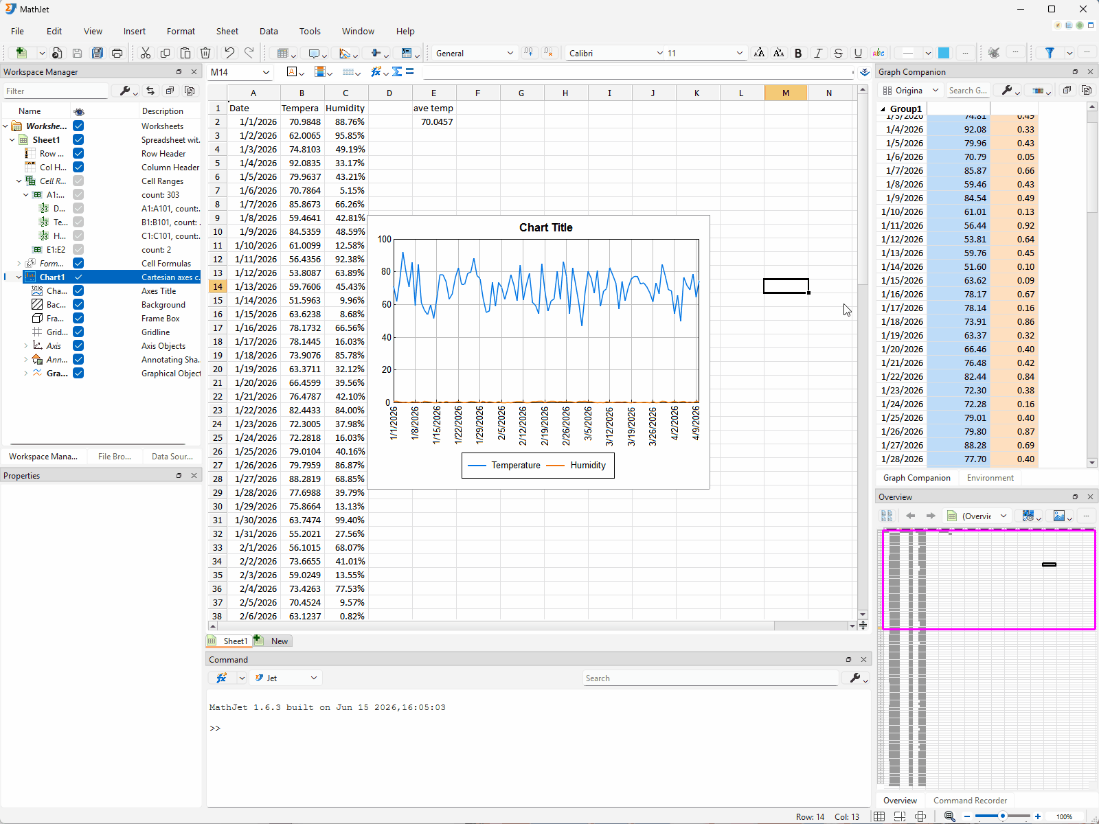
In the Workspace Manager’s toolbar, find the Expand All button (the last button on the toolbar). Click it. The tree expands fully; you’ll see nodes named after cell ranges like Sheet1:A2:A101, Sheet1:B2:B101, and Sheet1:C2:C101 — one per data column — plus a node for the chart (something like Sheet1:Chart1) and the formula cells.
Multi-pane sync. Click Sheet1:B2:B101. Three things happen at once:
- The cell range B2:B101 highlights in the worksheet — the temperature column gets a visible selection.
- A line plot of the temperature values appears in the Overview Pane, giving you a quick shape-of-the-data view.
- Basic statistics — count, mean, standard deviation, min, max — appear in the Properties Pane docked on the lower-left side of the workspace.
Now click Sheet1:C2:C101. The same three panes update simultaneously: cells highlight, the Overview Pane re-renders for humidity, and the Properties Pane shows the new statistics.
A single click on a cell-range node coordinates four panes — Workspace Manager, worksheet, Overview Pane, and Properties Pane — with no explicit refresh or recomputation step.
Data Repair: edit cells by drawing on the Overview Pane preview. The Overview Pane’s mini-plot isn’t a passive readout. It’s an editable surface in its own right — you can draw a replacement curve on top of part of the line and MathJet rewrites the underlying cell values to match.
Data Repair works on any 2D graph in MathJet — the main chart in the worksheet, the Overview Pane’s mini-plot, anywhere a 2D line is drawn. We’re using the Overview Pane here because it’s the most convenient surface for this kind of editing: a single click on a Workspace Manager cell-range node creates (or switches) the mini-plot to exactly the cells you want to repair, and the single-series view is more focused than a main chart carrying multiple overlapping lines — much easier to target individual data points without confusion.
Click Sheet1:B2:B101 again to put the temperature line back in the Overview Pane. Click the Data Repair button on the Overview Pane’s toolbar (the same feature is also reachable from Data → Visual Editing → Data Repair in the main menu). The Overview Pane enters Data Repair mode: a red square marker appears and follows your mouse, snapping to the nearest data point on the mini-plot. When the cursor changes to a target symbol, the marker is right on top of a data point — that’s the signal that you can begin drawing. (If you’re still in data nudging mode from Step 10, exit first with Esc; Data Repair is a separate mode activated by its own button.)
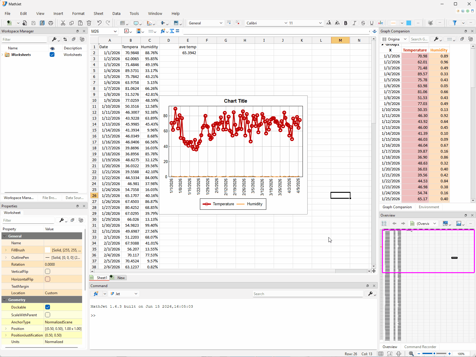
Place the first control point. With the cursor showing the target symbol over a data point near row 30, click the left mouse button. A control point is dropped at that location, anchored to the data point.
Add more control points to shape a Bezier curve. Move the mouse and click again to add a second control point — anywhere, not necessarily on a data point. The control points between data points let you shape the curve freely; a data symbol appears only at the control points you placed on actual data points. Add three or four more control points across rows 30–60, defining a smooth shape clearly different from the original noisy data underneath. If you don’t like a control point you just placed, press Backspace to delete it and try again.
Commit by double-clicking on a data point. Move the cursor over a data point near row 60 (the target symbol reappears) and double-click. The Bezier curve is committed.
When you commit, MathJet replaces the y-values of every data point whose x-coordinate falls within the curve’s x-range, using the curve’s value at that x. Three things happen at once:
- The cells in B30:B60 (the rows the curve passes over) update with the new y-values from your drawn curve.
- The main chart redraws — the temperature line now traces your bezier in that region.
- E2 (the AVERAGE) recalculates, and any other derived items linked to that range update the same way.
Continue or exit. After committing, you can start drawing another replacement segment without leaving the mode — just click a new starting point over a data point. To exit Data Repair mode, click the same Data Repair button (or menu item) again, right-click for the context menu and choose the exit item, or press Esc at any time. Esc also aborts an in-progress drawing if you started one and want to back out.
This is the third edit surface you’ve seen — beyond typing in cells (Step 9) and dragging chart points (Step 10). The Overview Pane’s mini-plot, when populated by a Workspace Manager cell-range selection, is a third way to write to the underlying data. Edit through any of them; the other two follow.
The Data Repair feature is named for the use case it was designed for — repairing or smoothing noisy measurement data without typing new cell values one at a time — but the underlying capability is general. Anywhere you can see a line plot of cell values, you can edit those values by drawing.
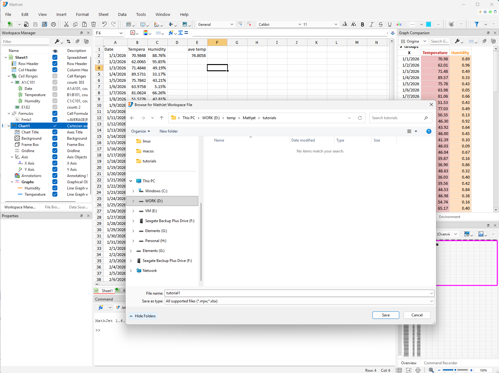
Step 13: Save your work
Section titled “Step 13: Save your work”Use File → Save, name the file first-analysis.mjw, and save it somewhere you’ll find it. The next tutorial picks up from this same workspace.
Close the workspace. Reopen it. The data, the formula in E2, the chart’s position over the cells, its zoom level, its split or maximize state, the companion table, the Workspace Manager’s expanded tree, and the cursor position all return as you left them.
A .mjw workspace is the durable unit. It contains the data, the formulas, the chart definition, the layout, the link graph, and the chart’s display state — all in a single file you can email, archive, or check into version control. It reopens to exactly the state you saved.
What you’ve learned
Section titled “What you’ve learned”- How to insert a worksheet into a fresh MathJet workspace.
- How to load a CSV file into MathJet via drag-and-drop and format columns (e.g., applying percentage display).
- How standard Excel formulas (e.g.,
=AVERAGE) work in MathJet’s spreadsheet without configuration. - How to create an XY chart inside the worksheet itself, with the chart floating over the cell area rather than living on a separate sheet.
- How to manage the chart’s display state with the semi-transparent button row: Maximize / Restore for full-area viewing and Pin for keeping the chart anchored while the worksheet scrolls; plus the chart-toolbar trio Split Chart / Split Axis / Recombine Graphs for handling series with very different scales — stacked sub-panels (Split Chart) or overlapping plot area with multiple y-axes (Split Axis).
- How to navigate a MathJet chart: mouse-wheel zoom, the Overview Pane’s visible-region rectangle, and the
fshortcut for fit-to-data. - How the Graph Companion table mirrors the chart’s data, and how selection sync runs across three views — between plot, table, and worksheet cells — with the Pin button auto-scrolling the worksheet to a selected row when needed.
- That MathJet’s interactive value-editing features (data nudging, Data Repair) are off by default — you explicitly enter each mode via its own menu/toolbar action and exit when you’re done, so accidental edits while exploring aren’t possible.
- The three halves of MathJet’s live linking — three different ways to edit the same underlying data:
- Edit a cell directly (Step 9) → chart and dependent formulas update.
- Drag a point on the chart with data nudging (Step 10) → the underlying cell and dependent formulas update.
- Draw a curve in the Overview Pane’s mini-plot with Data Repair (Step 12) → the underlying cells, the main chart, and dependent formulas all update.
- How to customize a chart object’s appearance via the Edit Properties dialog (Step 11) — every chart element exposes editable properties grouped by category, with changes applied live as you adjust them. The lightweight example here covered just line width and color; the full surface is documented in the Appearance reference.
- How the Workspace Manager coordinates four panes simultaneously when you click a cell-range node: worksheet selection, Overview Pane preview, Properties Pane statistics, and the cell range itself.
- That a
.mjwworkspace is a single file containing data, formulas, chart state, and view layout together — durable across save, close, and reopen.
Next steps
Section titled “Next steps”The natural next tutorial is Tutorial 2: Mixing Python and Excel formulas in the same spreadsheet. It picks up from this same workspace and shows the polyglot formula bar — calling NumPy and pandas directly from cells, alongside the Excel formula you wrote here.
If you came to MathJet from a specific background, jump to your entry point:
- Coming from MATLAB? → Tutorial 3: Bringing your MATLAB scripts into MathJet
- Coming from Python or Jupyter? → Tutorial 4: Upgrading a Jupyter notebook with MathJet’s kernel
- Want to see more of the patented interactive visualization features? → Tutorial 6: Interactive plots that explore themselves
Troubleshooting
Section titled “Troubleshooting”The CSV didn’t load when I dragged it onto the worksheet. Make sure you’re dragging onto the worksheet area itself (the cell grid), not onto a toolbar or an empty workspace area. If drag-and-drop doesn’t work on your platform, use File → Open and select the CSV instead.
The chart appears on a separate sheet instead of inside the worksheet. MathJet’s default placement is in-worksheet. If your install is configured to use chart sheets by default, change it in Preferences → Charts → Default placement, or explicitly insert the chart into the worksheet by selecting the data and using Insert → Chart in worksheet.
The semi-transparent button row doesn’t appear when I click the chart. Make sure the chart actually has focus (its border may show a focus indicator). If clicking the chart isn’t transferring focus, click once on a worksheet cell, then click on the chart — the focus should transfer cleanly.
Dragging a point on the chart doesn’t update the cell. You’re not in data nudging mode. Activate it via Data → Visual Editing → Data Nudging (or its toolbar button); the semi-transparent circle should appear, snapping to the nearest marker. If you are in nudging mode (the circle is visible) but values still aren’t updating, the chart’s source range may have been set to a snapshot rather than a live reference; recreate the chart by dragging across the column-A through column-C headers to re-select all three columns and using Insert → Chart → Line Graph → 2D Line (or the Insert Chart tool button) as in Step 4.
Drawing a curve in the Overview Pane doesn’t change cell values. Two common causes: (1) You forgot to enter Data Repair mode — click the Data Repair button on the Overview Pane’s toolbar (or use Data → Visual Editing → Data Repair) before clicking control points; the red square marker should appear, snapping to data points. (2) You placed control points but haven’t committed yet — the curve commits only when you double-click over a data point. Until then the curve is a draft and the cells don’t update. Press Esc to abort and start over.
Clicking a Workspace Manager cell-range node highlights the cells but the Overview Pane and Properties Pane don’t update. Both panes need to be visible (not minimized or hidden) to render their respective views. Check the View menu and make sure the Overview Pane and Properties Pane are toggled on; they default to visible but can be hidden manually.