
Bringing your MATLAB® scripts into MathJet®
25 minutes · For users coming from MATLAB. Working MATLAB experience required.
If you’ve written enough MATLAB to feel ownership over a folder of .m files, the question you actually want answered is: how much rework does MathJet require? This tutorial answers that question on real code. You’ll open an existing .m script — about thirty lines that load data, fit a regression, and plot the result — run it in MathJet’s MATLAB-syntax-compatible interpreter, and confirm the output. Then you’ll extend the workflow with a Python step that consumes the same data the MATLAB script produced, without rewriting the original .m file. The point isn’t to convert you off MATLAB; it’s to show that you can keep your MATLAB knowledge and gain the rest of MathJet’s runtime as a side effect.
Before you start
Section titled “Before you start”- MathJet installed. Download for your platform.
- No MATLAB installation required. MathJet implements MATLAB-compatible syntax in its own interpreter. You don’t need a MATLAB license or a MATLAB installation to run
.mfiles — they execute in MathJet’s interpreter directly. (MATLAB is useful in Step 3 if you want to verify outputs side by side, but it’s not required.) - The sample script and data. Download
experiment_results.mand the companionmeasurements.csv. Put them in the same folder. - Working MATLAB experience. You should be comfortable with
readtable, basic indexing, anonymous functions, andplot/scatter. The tutorial doesn’t introduce MATLAB syntax from scratch. - (Optional) MATLAB itself. Useful if you want to run the same script in both environments and compare outputs side-by-side. Not required to complete the tutorial.
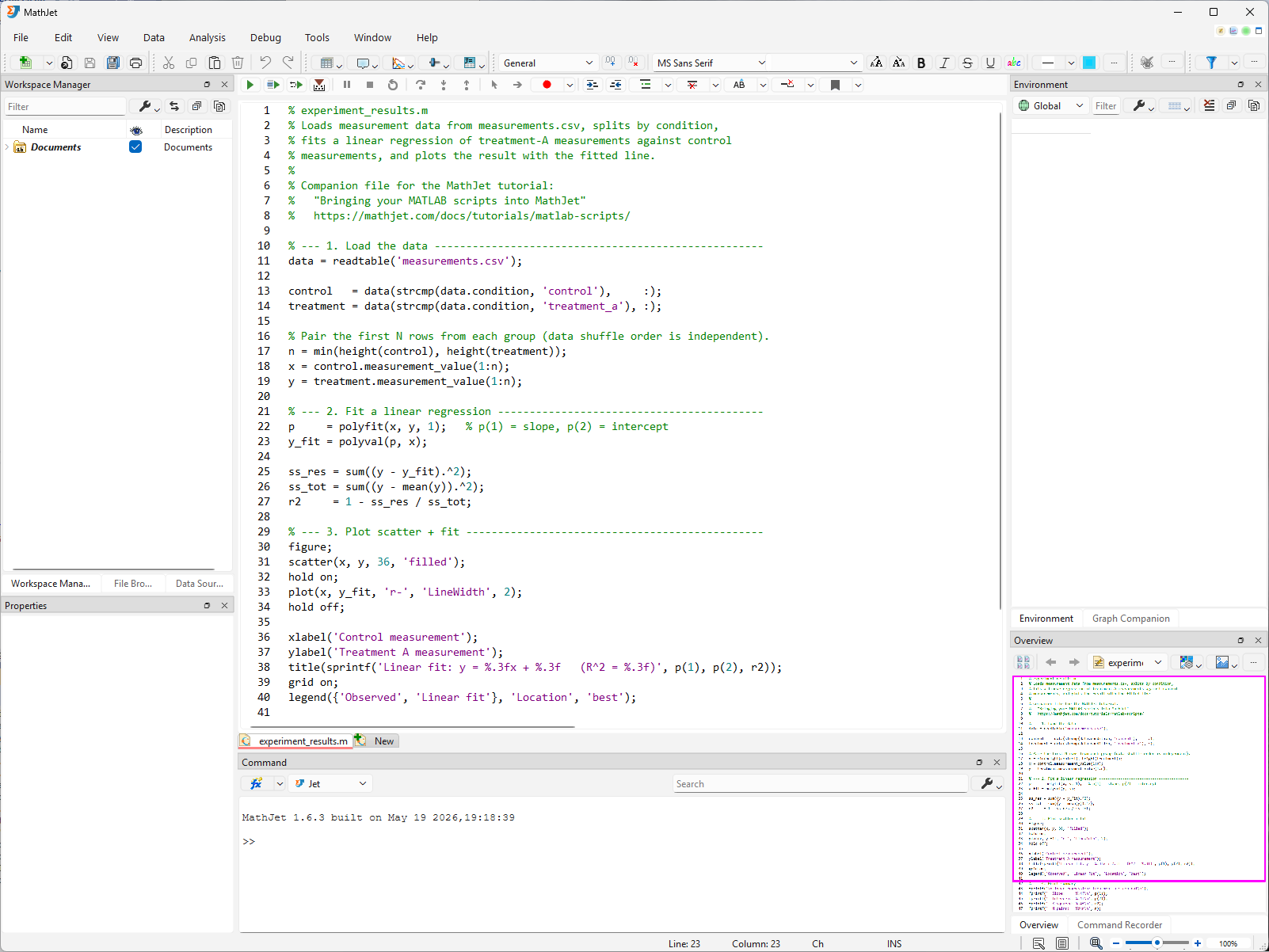
Step 1: Look at the script
Section titled “Step 1: Look at the script”Open experiment_results.m in any text editor (or in MathJet’s editor, if you’ve already launched it). The script is about thirty lines and does three things:
- Loads
measurements.csvwithreadtable, splits the rows byconditioninto a control group and a treatment group. - Fits a linear regression with
polyfit(x, y, 1), computes the fitted values withpolyval, and reports slope, intercept, and R² to the command window viafprintf. - Draws a scatter plot of treatment-vs-control with the fitted line on top, with axis labels and a title.
If you have MATLAB installed, run the script there once now. Note the slope, intercept, and R² values, and screenshot the figure. You’ll compare against MathJet’s output in Step 3.
Step 2: Run the script in MathJet
Section titled “Step 2: Run the script in MathJet”Launch MathJet, then either:
- Drag
experiment_results.mfrom your file manager into MathJet’s main window, or - Use File → Open and pick the script.
MathJet opens the file in a script editor view. There’s no “select language” dialog — .m files are recognized by extension and routed to MathJet’s MATLAB-syntax interpreter automatically. No MATLAB license is needed. MathJet’s interpreter is its own implementation of the MATLAB language, built from the ground up — it doesn’t call MATLAB, doesn’t link to MATLAB libraries, and doesn’t require a MATLAB installation or license on your machine.
Click Run (or press F5). MathJet executes the script. You’ll see:
- Text output in the Command Editor at the bottom of the workspace — the slope, intercept, and R² values from
fprintf. - A new chart sheet appears in the workspace with the scatter-plus-fit plot the script’s
figureandplotcalls produced. - The Environment Pane on the right populates with the script’s workspace variables:
data,control,treatment,x,y,p,y_fit.
The script ran without modification.
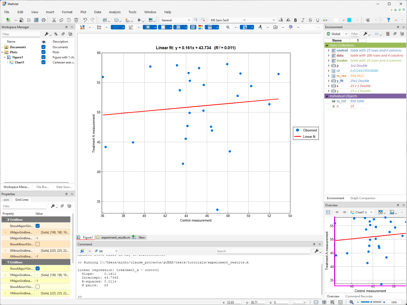
Step 3: Verify the output against MATLAB (optional)
Section titled “Step 3: Verify the output against MATLAB (optional)”If you ran the script in MATLAB earlier, compare:
- The slope, intercept, and R² values printed in MathJet’s console should match MATLAB’s command-window output to within numerical-precision noise (typically identical to ~12 decimal places).
- The scatter plot’s point distribution and fitted-line slope should look identical. Default colors and font sizes will differ — MathJet renders MATLAB-produced figures through its own plotting engine — but the data being plotted is the same.
If anything differs in a way you can’t explain by floating-point precision, that’s a real compatibility issue worth reporting — see Troubleshooting at the bottom.
Step 4a: Inspect the workspace variables
Section titled “Step 4a: Inspect the workspace variables”The Environment Pane on the right shows every variable in your MATLAB-syntax workspace — data, control, treatment, x, y, p, y_fit, and any scalars your script defined. Clicking a variable’s name updates the Overview Pane (lower-right) with a visualization of that variable’s contents — the data itself stays out of the cell area. To render the data inline as a cell block, click the expansion button to the left of the variable’s name. The block opens with an automatically chosen table style; you can override the choice from the Table Style dropdown on the block’s header. The full set of Environment Pane features is documented in the Environment Window reference — worth a quick browse so you know what’s available.
Click around — MathJet picks the visualization that fits the data. Click the name p (the 1×2 polyfit result): the Overview Pane shows the slope/intercept pair. Click a scalar like n (the paired sample size — the script computed it as min(height(control), height(treatment))): the Overview Pane simply displays the value. Click x (the 25-value control vector): the Overview Pane renders it as a line plot. Click data (the 4-column table loaded from measurements.csv): the Overview Pane shows a heatmap preview of the whole table, with the color-mapping range auto-computed independently per column — each column gets its own min-to-max scale so the dynamic range of one column doesn’t flatten the others. Now click the expansion button to expand data into a cell block, then click the column header condition inside the block — the Overview Pane redraws as a histogram (count by category, because condition is categorical). Click measurement_value — the Overview Pane redraws as a line graph, the right view for a continuous numeric column. The Overview Pane reacts to whatever you’ve selected, and the visualization adapts to the data’s shape and type, not the variable’s name.
Step 4b: Open variables in the Variable Editor
Section titled “Step 4b: Open variables in the Variable Editor”Double-click x in the Environment Pane — or click the floating Show in Variable Editor button that appears when you hover the variable — and MathJet opens x in its Variable Editor: a specialized spreadsheet view tailored for inspecting and filtering a single variable.
The Variable Editor uses the underlying data table’s column names and row names directly as headers — for x, that’s the column from measurements.csv the control group was drawn from, with the original CSV row labels along the left. Above the data, MathJet automatically adds three header rows that don’t exist in the raw table:
- A value filter control where you can type an expression like
< 50or a range condition to live-filter rows. - A min row showing the per-column minimum.
- A max row showing the per-column maximum.
These three are the defaults. The full set of available column headers — value filter, min, max, sparklines, and others — is configurable from Format → Table Column Headers; toggle each header type on or off to match what you want to see for the variable in front of you.
Each column name also has a small dropdown button next to it — the same affordance Excel puts on tabled ranges. Click it to sort ascending/descending, multi-select category filters, hide columns, and so on. Value-filter expressions and per-column dropdown filters compose: a value filter plus a dropdown selection narrows the visible rows by both criteria.

The .m script created x; MathJet’s spreadsheet, chart, Environment Pane, Overview Pane, Variable Editor, and (in a moment) Python runtime all see the same x — no export, no copy, no format conversion.
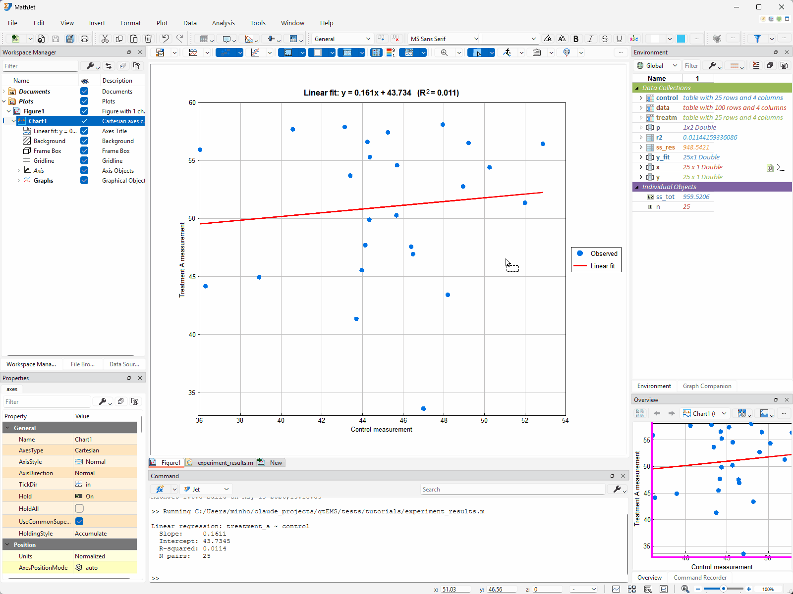
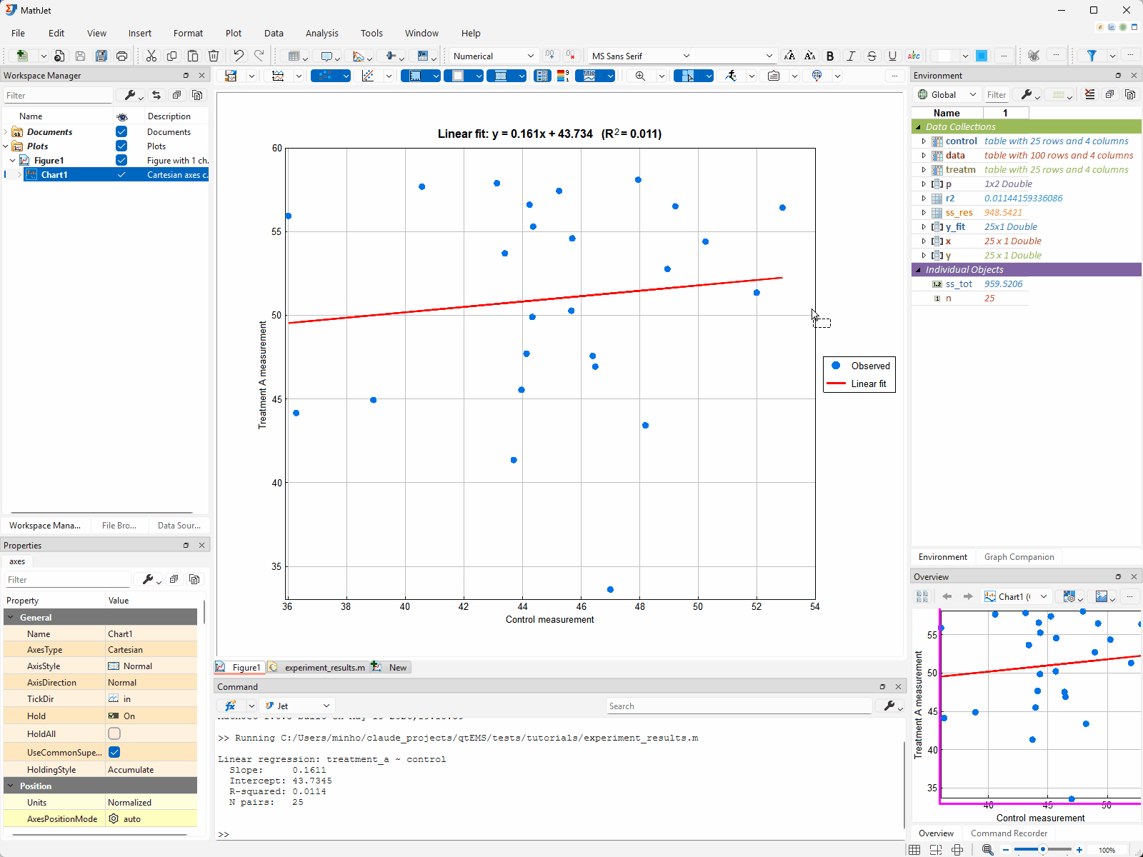
Step 5: Per-component dynamic links between the chart and its data
Section titled “Step 5: Per-component dynamic links between the chart and its data”When MathJet drew the scatter-plus-fit chart, it didn’t just produce a static image — it also recorded which variables every chart component (X coord, Y coord, …) came from and automatically established a dynamic link from each component back to its source variable. This happens for every graph MathJet creates, regardless of whether the graph came from the GUI or from a script’s plot() call. The links are on by default; you don’t have to opt in.
You can see and control the links per component. With the chart sheet active, open Plot → Links to Data Sources. The submenu lists one checkable action per source component the chart currently knows about — for this scatter plot, that’s an entry for the X coord and one for the Y coord. Each action is a toggle: checked means the link is active, unchecked means that one component is frozen at its current values. The list itself is dynamic — if you add a series later, a new entry appears; if a series loses its source variable, its entry disappears.
What the links do, when they’re on:
- Edit the variable, the chart redraws. Expand
yin the Environment Pane (the expansion button to the left of the name), then edit the cell fory(5)directly inside the cell block — type100and press Enter. The corresponding scatter point on the chart jumps up to y = 100. Press Ctrl-Z to undo; the chart returns to its previous state. You don’t need to open the Variable Editor to make this edit — the expanded cell block in the Environment Pane is editable in place, the same way the cell ranges in Tutorial 1 were. - Selection follows the link, in both directions. Click any point on the scatter plot. The matching row’s cells in both the
xandycell blocks in the Environment Pane are highlighted at the same instant, and each block auto-scrolls so the highlighted cell is visible. Selection works the other direction too — click a cell in thexoryblock and the corresponding scatter point lights up on the chart.
Disable one link to break the sync for that component. Open Plot → Links to Data Sources → X Coord to uncheck the X-coordinate link. The Y link stays active. Now click a graph point: only the cell in the y block highlights; the x block doesn’t respond, because the chart no longer tracks which x-value each point came from. Edits to y still propagate to the chart; edits to x no longer do. Toggle the action again to restore the link.
A note on derived variables. When you changed y(5) to 100, the scatter point moved but the fit line didn’t update. That’s because y_fit is a derived variable — the script computed it once from polyfit(x, y, 1) and polyval, then plotted it. The dynamic link tracks variable changes, not derivations: editing y doesn’t re-run polyfit. If you want y_fit to track y automatically, you can express that relationship using MathJet’s => dynamic-variable operator in a .jt script (or in the Command Editor). => defines a live derivation that recomputes whenever any of its source variables changes — plain = is a one-time snapshot, => is a standing rule. For this fit, you’d replace the script’s two assignments with p => polyfit(x, y, 1) and y_fit => polyval(p, x). Now y_fit is a live function of x and y (chained through p), and editing y propagates: p recomputes, then y_fit, and finally the chart’s fit line redraws.
Step 6: Extend the workflow with a Python step
Section titled “Step 6: Extend the workflow with a Python step”The MATLAB script fit a linear regression. Suppose you want to compare it against a non-linear baseline — say, a random-forest regressor from scikit-learn. You could rewrite the script in Python, or you could add a Python step that consumes the same x and y the script already produced.
Don’t touch experiment_results.m. Open the Command Editor docked at the bottom of the workspace, and set its language to Python (the language selector is in the Command Editor’s toolbar). Type:
from sklearn.ensemble import RandomForestRegressorimport numpy as np
x_arr = np.array(x).reshape(-1, 1)y_arr = np.array(y)
model = RandomForestRegressor(n_estimators=100, random_state=42)model.fit(x_arr, y_arr)y_rf = model.predict(x_arr)
Press Enter after each line, or paste the block and run it together.
x and y are the same variables the MATLAB script created. They’re available in the Python interpreter without any conversion, import, or copy. np.array(x) gives NumPy a view of the same memory MATLAB-syntax code wrote, because both runtimes are pointing at MathJet’s shared variable store.
y_rf (the random-forest predictions) now lives in the workspace alongside the MATLAB-produced variables. Open the existing chart sheet and right-click → Add series → choose x for X and y_rf for Y, with a different color.

Two languages, one chart, no boundary crossed.
Step 7: View the data in the spreadsheet
Section titled “Step 7: View the data in the spreadsheet”Right-click control in the Environment Pane and choose Send to → New Worksheet. (control has 25 rows and fits on screen without scrolling, which makes it easier to compare with a copy in a moment; data would work the same way but you’d be scrolling 100 rows.) MathJet creates a new worksheet tab and places a variable cell block for control anchored at A1, expanded by default. The block shows a header row with the variable’s name and size/type, the table’s column names underneath, then the 25 data rows in columns A through D.
This is the same kind of variable cell block you used in Tutorial 2 — click the collapse handle to shrink it to a single cell showing control, drag the collapsed block’s border to reposition it anywhere on the worksheet. The variable doesn’t move; only its on-screen placement does.
Three equivalent paths to get a variable into a worksheet. Send to → New Worksheet (used here) is one. Dragging the variable from the Environment Pane directly onto any worksheet tab — or onto a specific cell on that tab — is another. Writing the variable to a cell with the
#operator from Tutorial 2 is the third. All three end with the same variable cell block in the worksheet.
Now compare two representations side by side. Go back to the Environment Pane and click the variable-name header cell for control there — that single click selects the entire content of the variable’s cell block (the column-name row plus all 25 data rows) in one shot, no drag needed. Right-click and choose Copy from the context menu (or press Ctrl-C). Switch back to the new worksheet, click I2, and paste with Ctrl-V. You now have two copies of control’s contents on the same worksheet — both sourced from the same Environment Pane variable: the variable cell block at A1 (a live view onto control) and a plain cell-range copy at I2:L27 (column names at I2:L2, data at I3:L27).
These two look identical but mean different things to MathJet:
- The left block is the variable. Edits flow back to
controlin the interpreter and anything else linked to it. - The right block is just cells. Edits don’t propagate; it’s a snapshot, the way a paste from any other spreadsheet would be.
Write a formula that touches both. In cell G1, type:
=mean(control[[#Data],[measurement_value]]) - AVERAGE(K3:K27)The first term uses Excel’s structured-reference syntax to address control’s measurement_value column — [[#Data],[measurement_value]] means “the Data portion of the column named measurement_value” — and takes its mean through MathJet’s Jet runtime. The second term is the Excel AVERAGE of the corresponding cells in the plain-range copy (K3:K27 — column K because the source’s third column, measurement_value, lands in column K when pasted at I2). G1 shows zero (give or take floating-point precision noise): same 25 numbers, two ways of organizing them, two different formula engines, identical arithmetic mean.
![Right-clicking control in the Environment Pane and choosing Send to → New Worksheet creates a new worksheet tab and places control's variable cell block at A1 — variable-name header row, column-name row underneath, 25 data rows in columns A through D. Clicking the variable-name header cell for control in the Environment Pane selects the entire block content; copying it and pasting at I2 on the new worksheet produces a plain cell-range copy at I2 (column names at I2, data at I3). The formula =mean(control[[#Data],[measurement_value]])-AVERAGE(K3:K27) typed into G1 evaluates to 0 — same 25 numbers, two ways of organizing them, two different formula engines.](/docs/images/tutorials/matlab-scripts/step-07-data-spreadsheet.gif)
The data your MATLAB script created is now also a spreadsheet you can edit, plot, and reference from formulas in any of MathJet’s languages — available in two forms (live variable view or plain-cell snapshot) depending on what you need.
Step 8: The honest scope of MATLAB compatibility
Section titled “Step 8: The honest scope of MATLAB compatibility”MathJet runs .m files using its own interpreter, which implements the MATLAB language. Most MATLAB syntax works directly. Some Toolbox-specific functions and Simulink integration aren’t supported — see the MATLAB compatibility reference for details. For most analytical workflows, your existing scripts will run without modification.
In more detail, here’s what doesn’t run today:
- Toolbox-specific functions. If your script depends on the Statistics and Machine Learning Toolbox, the Signal Processing Toolbox, the Optimization Toolbox, or any other Toolbox, those functions aren’t part of MathJet’s interpreter. The closest substitute for most analytical Toolboxes is the equivalent Python or R package — fortuitously, MathJet’s polyglot runtime makes the substitution painless (Step 6 above shows the pattern).
- Simulink integration. Simulink-driven workflows aren’t supported in MathJet today.
- MEX files and compiled MATLAB extensions. MathJet doesn’t load MATLAB’s compiled-extension format.
- Some less-common base-language edge cases. Mostly things like specific GUI-control functions, very old syntactic features, and platform-specific I/O.
For Toolbox-heavy scripts, the realistic path is to keep the analytical core in .m and replace the Toolbox-specific functions with Python or R calls in the same workspace, as Step 6 demonstrated. The full inventory of supported and unsupported functions, organized by category, lives in the compatibility reference linked above.
What you’ve learned
Section titled “What you’ve learned”- How to open and run an existing
.mfile in MathJet’s MATLAB-syntax-compatible interpreter without configuration. - How to verify MathJet’s output against MATLAB’s, function by function and value by value.
- How to inspect MATLAB-script workspace variables — name-click drives the Overview Pane’s auto-chosen visualization; the expansion button opens the variable inline as a cell block; the Variable Editor gives a single-variable Excel-table experience with configurable column-header rows (value filter, min, max, sparklines, …).
- How MathJet auto-establishes per-component dynamic links between a chart and its source variables (X coord, Y coord, …), how to toggle each link via Plot → Links to Data Sources, and how selection and value edits sync bidirectionally — including a brief tour of the
=>operator for live derivations when you need a derived variable likey_fitto keep tracking its sources. - How to extend a MATLAB workflow with a Python step that consumes the same shared variables — no rewrite, no serialization.
- How to send a workspace variable to a new worksheet (three equivalent paths: Send to → New Worksheet, drag-and-drop from the Environment Pane, or the
#operator), and how to compare a live variable cell block against a plain-cell snapshot of the same data using Excel’s structured-reference syntax inside formulas. - The honest scope of MathJet’s MATLAB compatibility today: the base language and common analytical functions run; Toolbox-specific code, Simulink, and MEX files don’t.
Next steps
Section titled “Next steps”If your existing analyses depend heavily on a specific MATLAB Toolbox, see Tutorial 5: R / RStudio — bringing your R workflows into MathJet. R has direct equivalents for most of the Statistics Toolbox, and the polyglot runtime makes it painless to call from a .m-driven workflow.
To see how the same shared-runtime model works for users coming from Jupyter, see Tutorial 4: Upgrading a Jupyter notebook with MathJet’s kernel.
For a deeper look at how MathJet handles plots beyond the figure/plot calls in this script, see Tutorial 6: Interactive plots that explore themselves. If you want analytics — characteristics tables, curve fits, derived graphs — run directly inside a chart, see Tutorial 7: Graph analytics: characteristics and dependent graphs.
Troubleshooting
Section titled “Troubleshooting”The script errors at readtable with “function not found”. MathJet’s readtable reads the same CSV format MATLAB does. The most common cause of this error is a path issue — the .m script and measurements.csv need to be in the same folder, or the script needs an absolute path. Check the working directory shown in MathJet’s status bar.
The plot in MathJet looks subtly different from MATLAB’s plot — different default colors, different font sizes. That’s expected. MathJet renders MATLAB-produced figures through its own plotting engine, which uses MathJet’s default chart styles rather than MATLAB’s. Visual fidelity is intentional only for chart contents, not chart styling. If you need MATLAB-identical styling, set colors and fonts explicitly in the script.
A specific MATLAB function I rely on isn’t implemented. Check the MATLAB compatibility reference for the function name. If it’s listed as unsupported, the typical workaround is to call the equivalent Python (NumPy/SciPy/scikit-learn) or R function from the script using MathJet’s polyglot runtime — Step 6 above shows the pattern.
MathJet® and the MathJet logo are registered trademarks of Jet Computing, LLC. MATLAB® is a registered trademark of The MathWorks, Inc. MathJet is not affiliated with, endorsed by, or sponsored by The MathWorks, Inc.