
Upgrading a Jupyter notebook with MathJet®'s kernel
25 minutes · For users coming from Jupyter or general Python notebooks. Working Python experience required.
Notebooks are the most familiar interactive surface for analytical Python work, and they have well-known weak points: kernel state you can’t inspect except through print(), plots that freeze the moment they render, DataFrames that look like tables but can’t be edited like one. This tutorial doesn’t ask you to abandon notebooks. It asks you to spend twenty-five minutes seeing what changes when you open a notebook you already have and run it through MathJet instead. You’ll connect the same notebook to a standard Jupyter kernel first, see the familiar behavior, then switch to MathJet’s own kernel and get live variable inspection, an editable spreadsheet view of any DataFrame, and matplotlib plots that become interactive MathJet graphics — all without modifying a single cell.
Before you start
Section titled “Before you start”- MathJet installed. Download for your platform.
- The sample notebook and data. Download
sample_notebook.ipynband the companionmeasurements.csv. Put them in the same folder. The notebook has about ten cells: it loadsmeasurements.csvwithpandas, computes per-condition summary statistics and confidence intervals, extracts a NumPy array and an overall mean, and draws twomatplotlibfigures (a boxplot and a time-series plot). - Working Python experience. You should be comfortable with pandas DataFrames,
matplotlib.pyplot, and the cell-by-cell execution model of Jupyter notebooks. The tutorial doesn’t introduce Python syntax from scratch. - (Optional) Jupyter or JupyterLab. Useful if you want to run the same notebook in both environments and compare behavior side-by-side. Not required to complete the tutorial.
Step 1: Open the notebook in MathJet
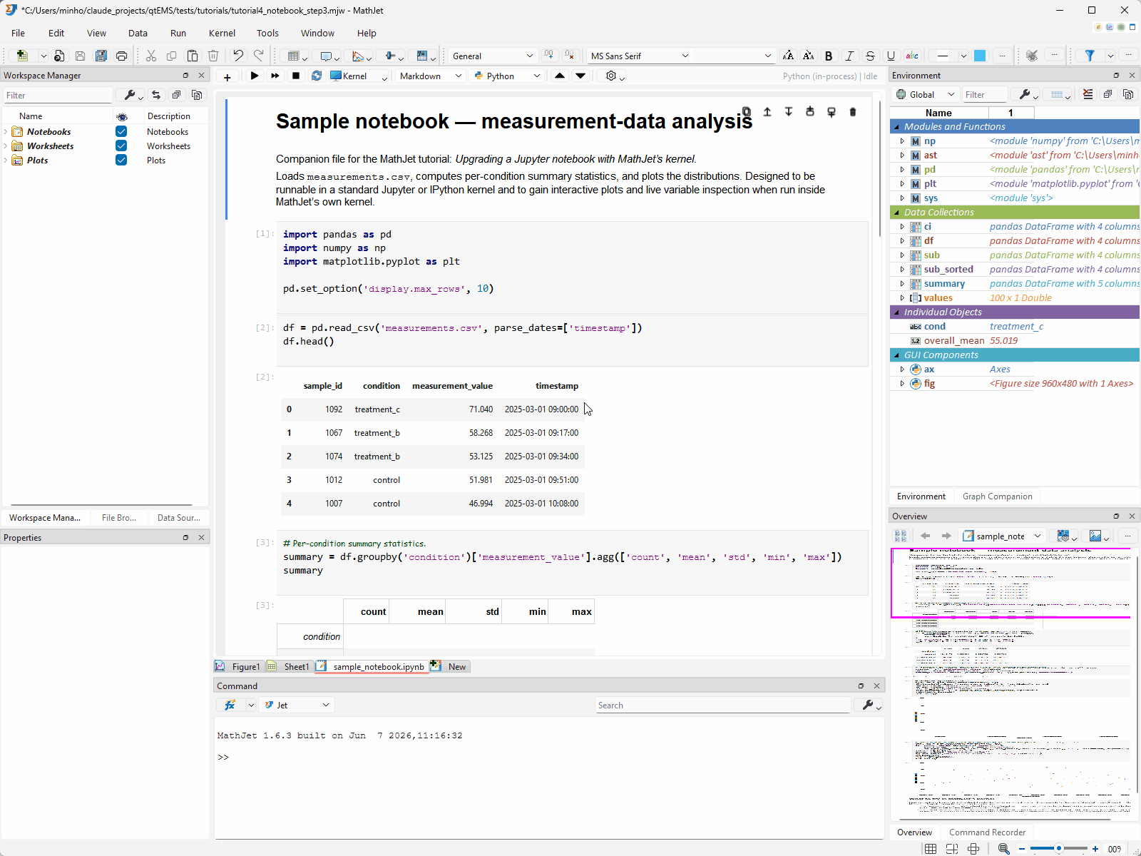
Section titled “Step 1: Open the notebook in MathJet”Launch MathJet. Either drag sample_notebook.ipynb from your file manager into MathJet’s main window, or use File → Open and select the file.
MathJet opens the notebook in a notebook editor view — the same vertical cell layout you’re used to from Jupyter or JupyterLab. Code cells, markdown cells, and any stored outputs are all visible. Cell boundaries, execution-order numbers, and the markdown rendering look familiar because MathJet reads the standard .ipynb JSON format directly; nothing about the file is converted or rewritten.
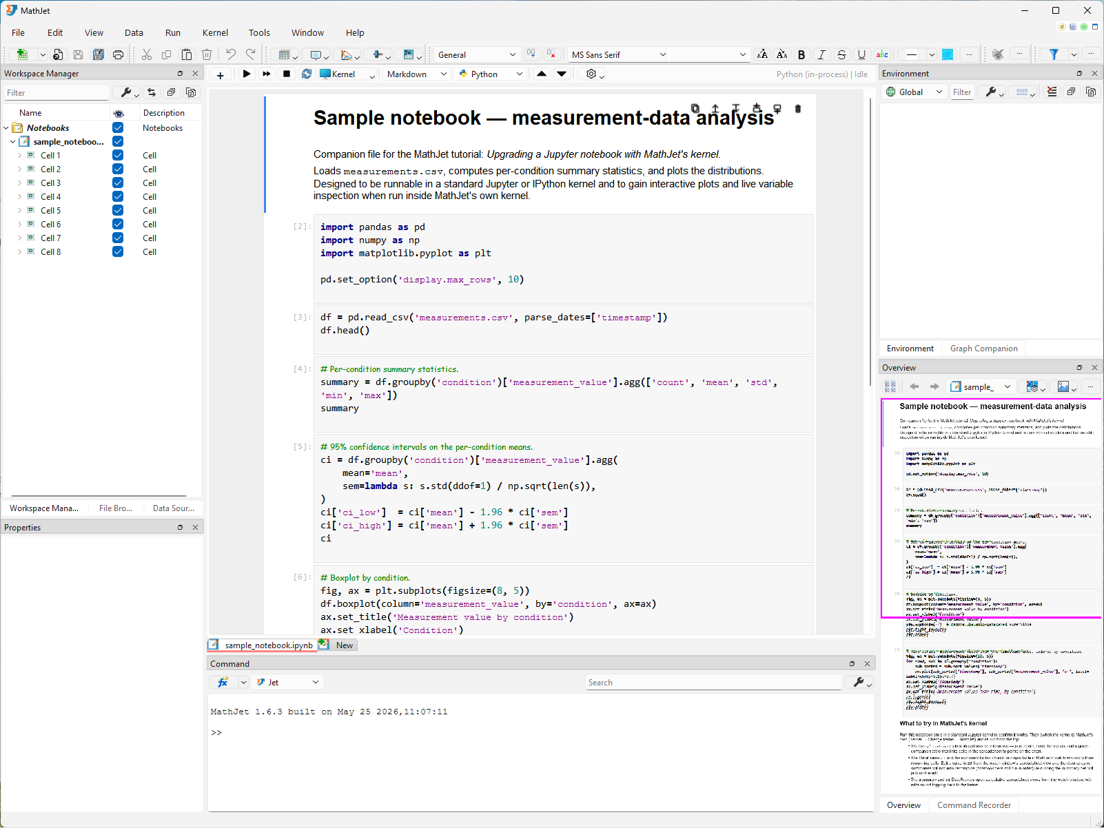
MathJet selects its in-process Python kernel by default but doesn’t launch it automatically — the kernel-status indicator on the top-right corner of the notebook toolbar reads Python (in-process) | idle. The existing stored outputs from the last Jupyter session are still visible; they’re read from the .ipynb file’s outputs field, not produced live.
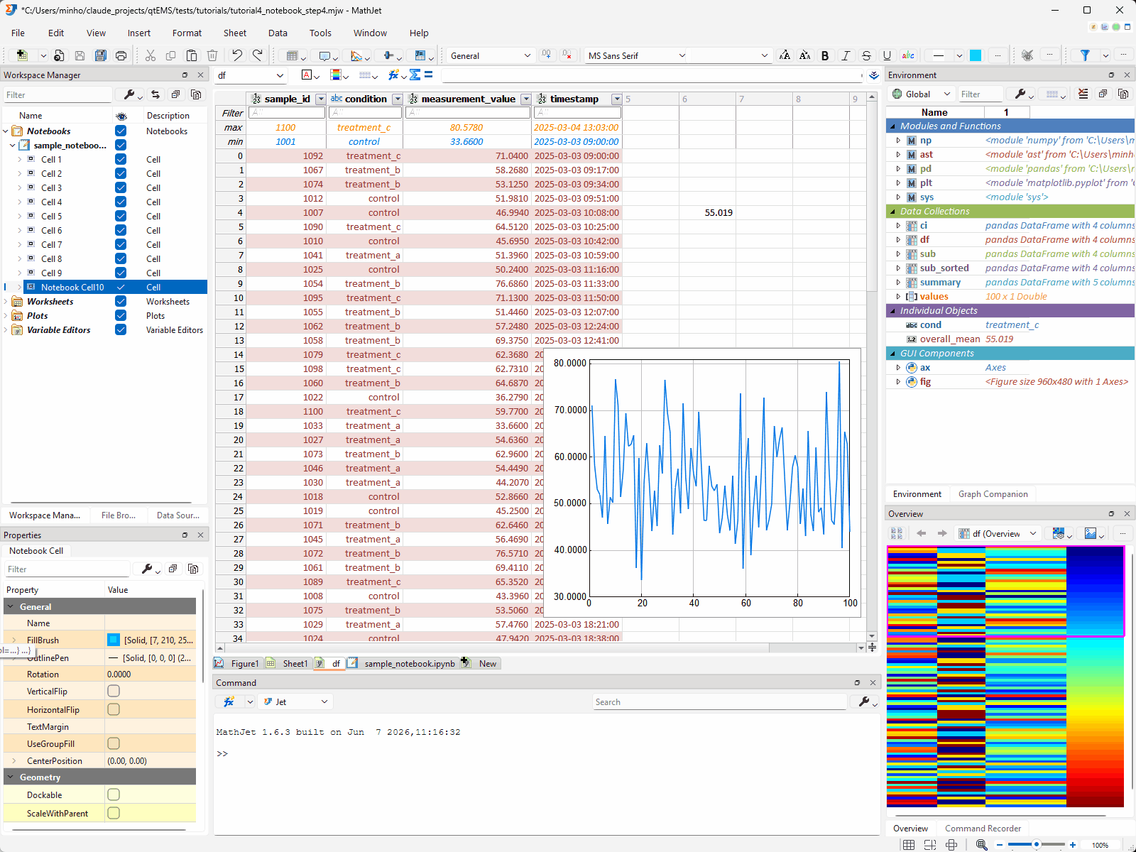
Two panes respond immediately to the notebook opening, even before any kernel is connected. The Workspace Manager (upper-left) shows a tree view of every cell in the notebook — markdown cells, code cells, and their outputs — giving you a structural overview you can click through to jump to any cell. The Overview Pane (lower-right) renders a miniature view of the entire notebook, with a draggable rectangle marking the portion currently visible in the editor — the same navigation surface you used for charts in Tutorial 1.
Step 2: Run on a standard Jupyter kernel — the baseline
Section titled “Step 2: Run on a standard Jupyter kernel — the baseline”Before upgrading anything, let’s run the notebook the familiar way. MathJet can connect to any standard Jupyter or IPython kernel, giving you byte-identical behavior with vanilla Jupyter.
Connect to a kernel. Open Kernel → Change Kernel (or click the kernel-status indicator in the notebook editor’s toolbar). The kernel picker opens with three sections:
-
In-process kernels (top) — kernels already running in this session. Empty on first launch.
-
New kernels — available kernels you can start. MathJet distinguishes three tiers:
- Standard Jupyter kernel — a plain-messaging kernel without the comm channel. Variables stay inside the kernel process; MathJet’s GUI can’t see them. This is what we’ll use for the baseline.
- ipykernel (with comm channel) — an IPython kernel with the comm channel enabled. MathJet can populate the Environment Pane and intercept matplotlib figures across the comm channel, but variables still live in the kernel process. This is the middle tier; we’ll skip it for now to keep the baseline-vs-upgrade contrast clean.
- MathJet kernel — MathJet’s own kernel, with variables in MathJet’s shared data frame. This is what we’ll switch to in Step 3.
This section also includes Start Remote Kernel for connecting to a Jupyter server on another machine. For a detailed comparison of the three modes — what each gives you and when to use which — see Choosing a kernel.
-
Connect to existing kernel — attach to a kernel process that’s already running outside MathJet, by connection file or URL.
Pick a standard Jupyter kernel entry (not an ipykernel entry — the picker distinguishes them) for now. The kernel starts, and the status indicator changes to the kernel’s name.
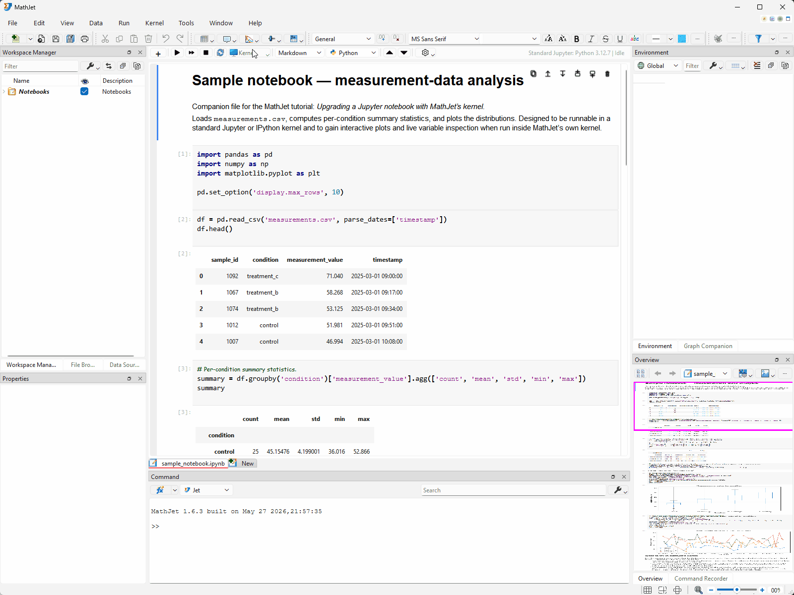
Run all cells. Press Run → Run All Cells (or the toolbar’s Run All button). The cells execute top-to-bottom, just like Shift-Enter repeated in Jupyter:
- Text outputs print below their cells.
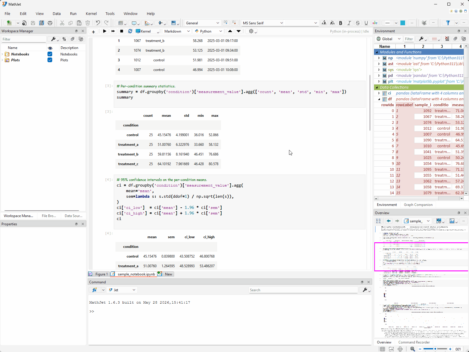
- The pandas summary table renders as a styled HTML table in the cell output area.
- The two
matplotlibfigures appear as static PNG images embedded in the output — the same rendering you’d see in JupyterLab’s default%matplotlib inlinemode.
If you have Jupyter or JupyterLab open alongside, you can compare: the cell outputs are identical. MathJet is acting as a notebook frontend, sending cell contents to the IPython kernel over the standard Jupyter messaging protocol and rendering the results.
What you can’t do (yet). Try to inspect a variable — say, the df DataFrame the notebook created. In vanilla Jupyter, you’d add a new cell with df.head() or print(df.shape) and execute it. That works here too — but there’s no other way to see df. The Environment Pane on the right is empty; the Overview Pane shows nothing. Variables exist only inside the kernel process, opaque to MathJet’s GUI. The matplotlib figures are frozen PNGs — you can’t zoom, pan, or click on data points.
This is the baseline. Everything you know about Jupyter notebooks works identically. Now let’s see what changes.
Step 3: Switch to MathJet’s kernel — the upgrade
Section titled “Step 3: Switch to MathJet’s kernel — the upgrade”Change the kernel. Open Kernel → Change Kernel. In the In-process kernels section at the top, pick the Python (in-process) kernel. The old kernel shuts down and MathJet’s in-process kernel starts in its place.
Re-run all cells. Press Run → Run All Cells. The cells execute top-to-bottom again — the same Python code, the same import statements, the same function calls. But this time, several things are different.
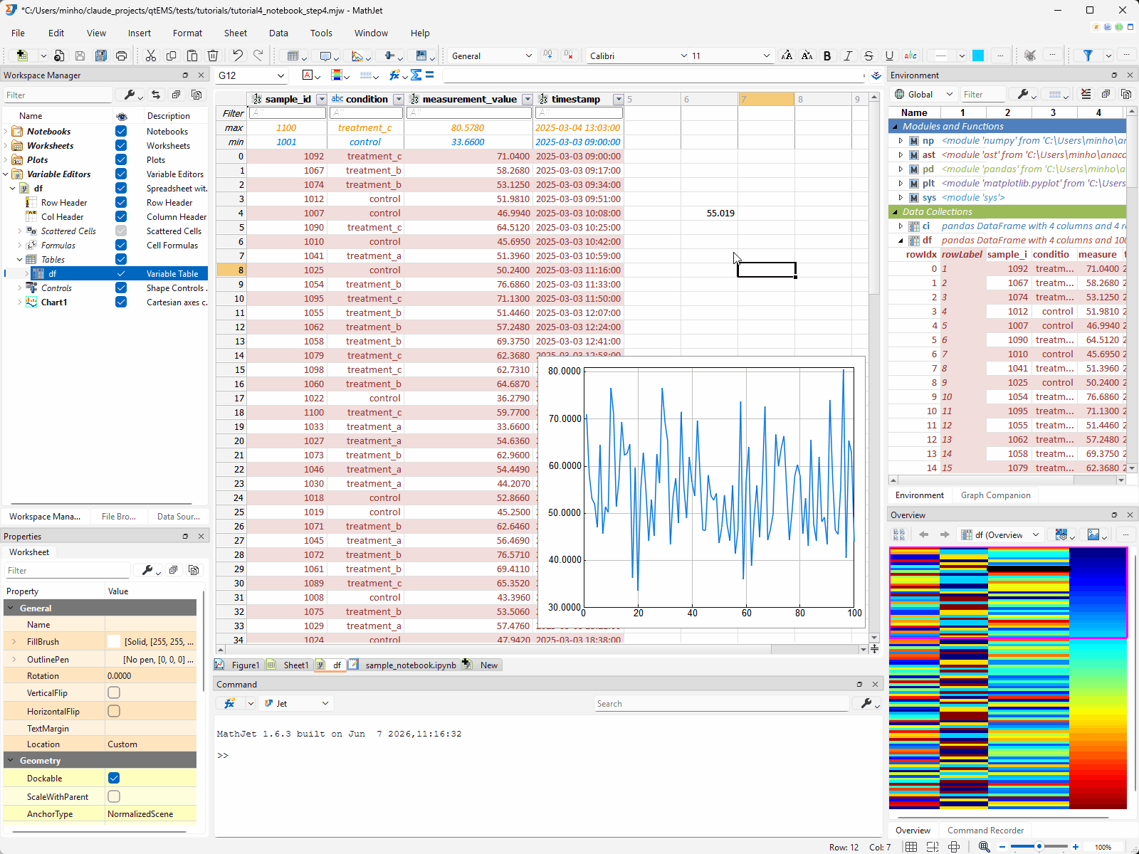
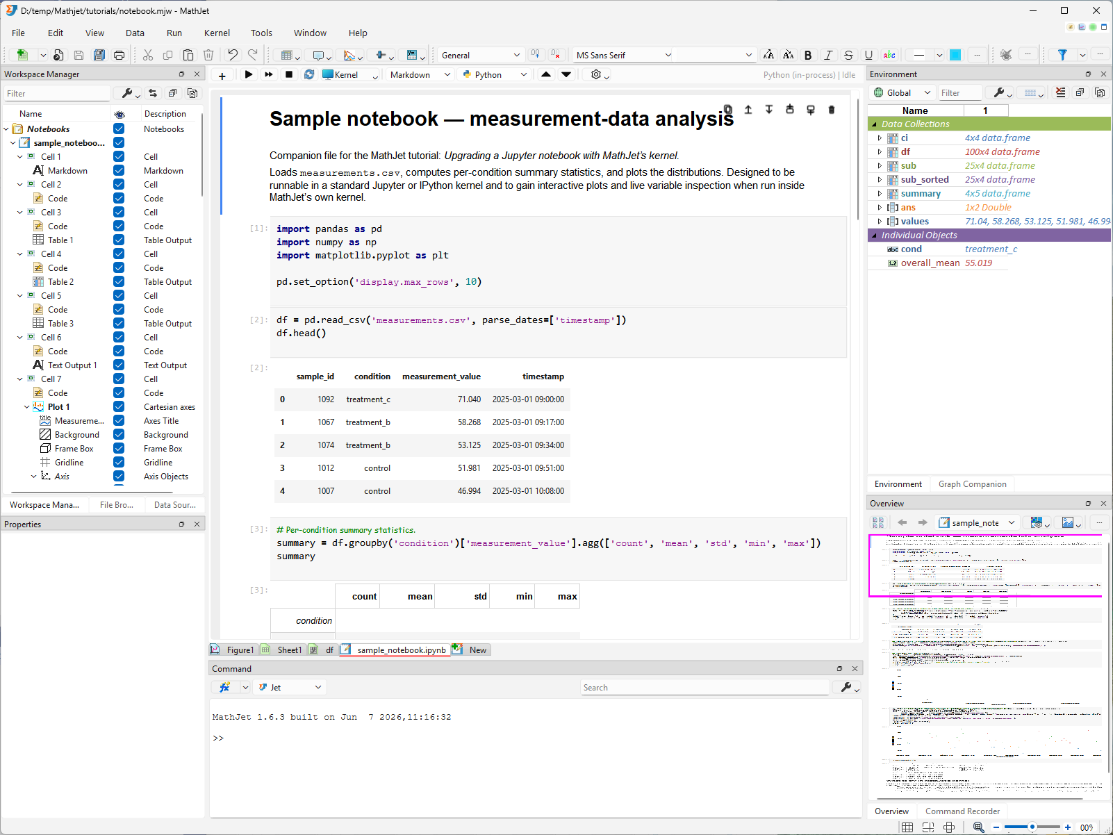
The Environment Pane fills up
Section titled “The Environment Pane fills up”Look at the Environment Pane docked on the right. It’s no longer empty. Every variable the notebook created — df, summary, ci, values, overall_mean, and the two figure objects — appears as a row. Each row shows the variable’s name, a brief description of its type and size, and an expansion handle.
This happened automatically. MathJet’s kernel feeds variable state back to the GUI after every cell execution. You didn’t add any print() calls or install any extensions; the inspection is a side effect of the kernel architecture.
Click around. Click overall_mean in the Environment Pane. The Overview Pane (lower-right) displays the single scalar value. Click values (a NumPy array of all 100 measurements) — the Overview Pane shows a line plot of the raw values. Click df — the Overview Pane renders a heatmap preview of the DataFrame, each column on its own auto-computed color scale. The same adaptive visualization behavior from Tutorial 2 and Tutorial 3: the Overview Pane picks a shape-appropriate view for whatever you click.
Explore the columns. Click the expansion button on the left of the df header name to expand the variable cell block. Now click the condition column header. The Overview Pane switches to a histogram showing the count for each condition group. Click other column headers — measurement_value shows a distribution plot, timestamp shows a timeline — each column gets its own appropriate visualization. Double-click the condition histogram in the Overview Pane to promote it to a new figure tab (chart sheet) in the main window’s central tab area, where you can interact with it at full size.
This is the first upgrade: live variable inspection, always visible, for every variable in the notebook’s kernel — without modifying the notebook.
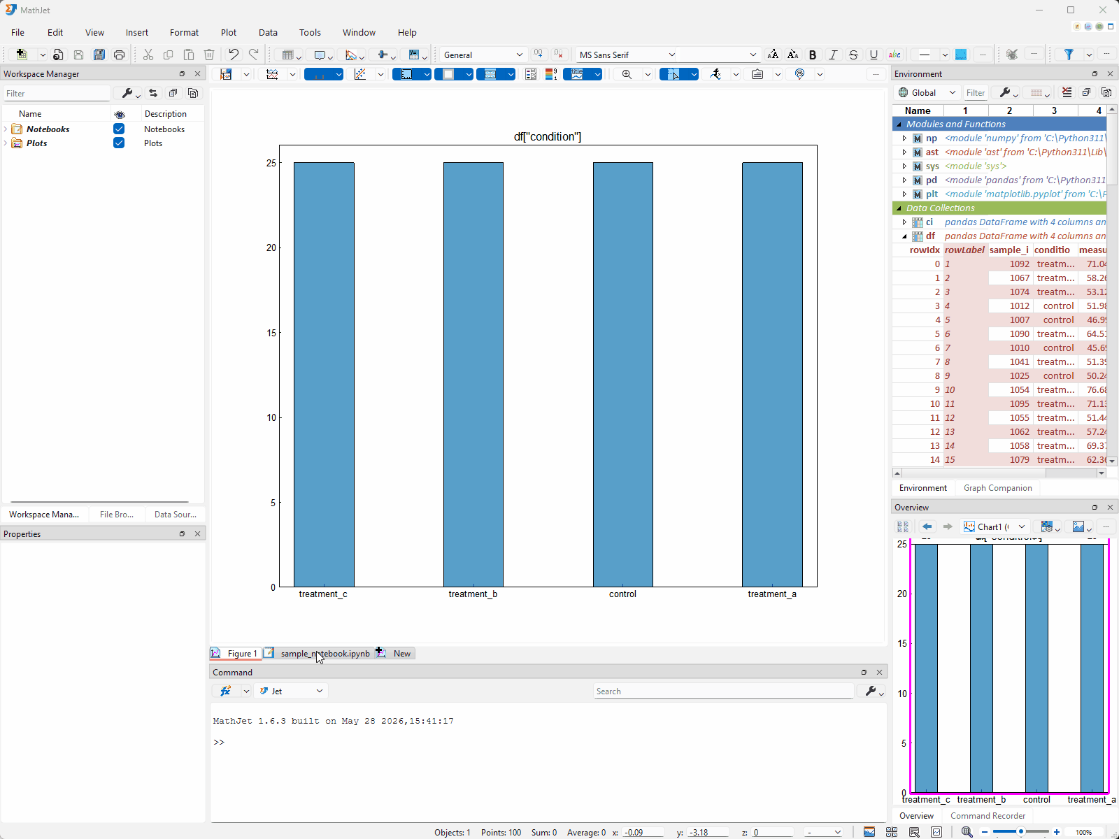
matplotlib plots become interactive MathJet charts
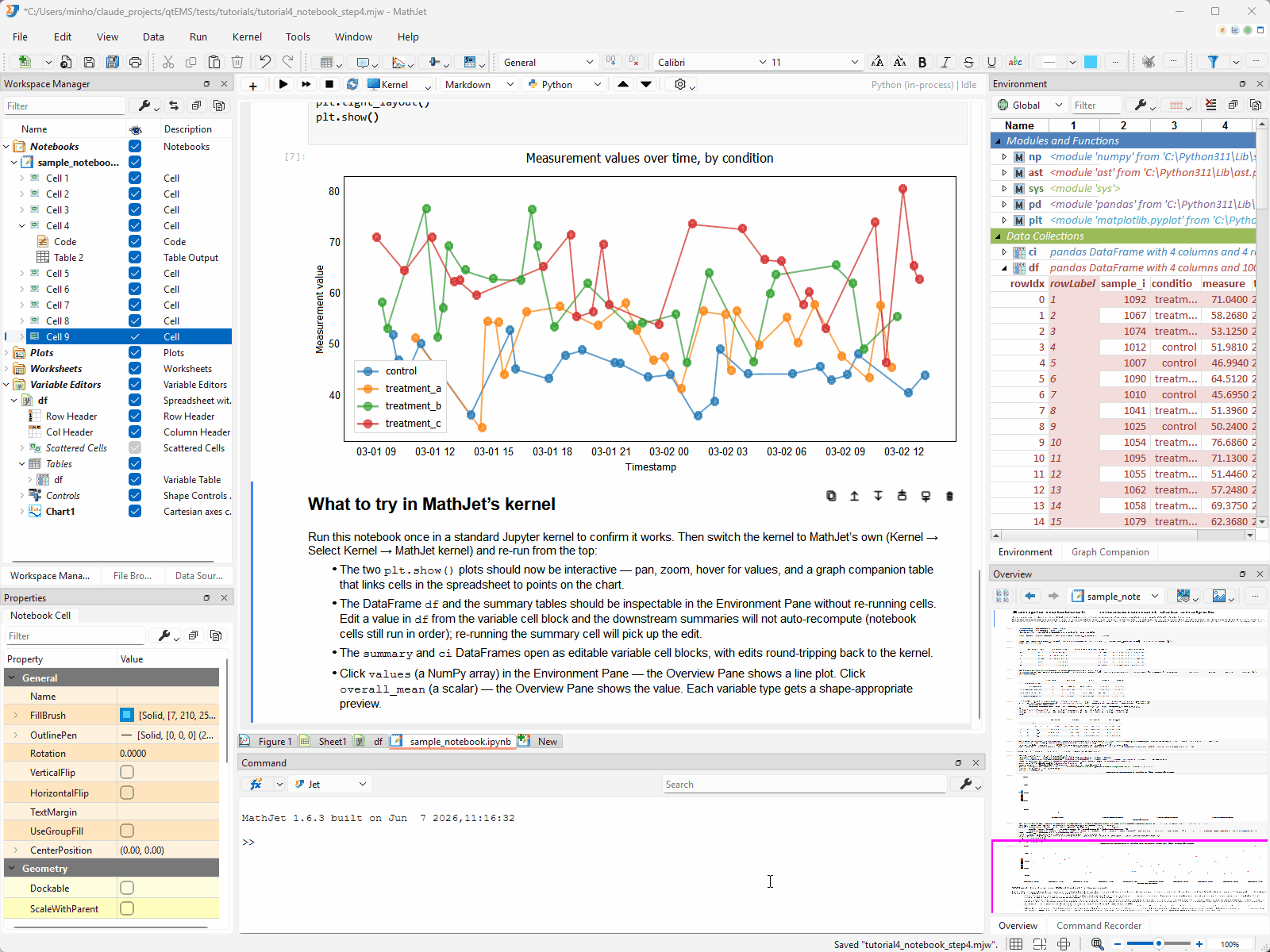
Section titled “matplotlib plots become interactive MathJet charts”Scroll down to the time-series chart (cell 8 — the last code cell). Instead of a static PNG, the output area now contains a native MathJet chart — the same kind of interactive chart you created from the GUI in Tutorial 1.
Zoom. Click the chart first to give it focus (this prevents accidental zooming when scrolling past). Now scroll the mouse wheel — the chart zooms in, centered on the cursor. Scroll backward to zoom out. Shift-drag to pan.
Split. The chart has multiple series (one per condition) on the same axis. The chart toolbar’s Split Chart and Split Axis buttons work exactly as they did in Tutorial 1, Step 6 — click Split Chart for stacked sub-panels, Split Axis for a YY-plot overlay, Recombine to undo.
Selection sync. Click and drag to draw a small selection rectangle around a data point. The Graph Companion table (tabbed behind the Environment Pane) highlights the corresponding row.
Now scroll up to the boxplot (cell 7). Click it — the Graph Companion table switches to a specialized boxplot table that shows the key statistical values for each group: Low Whisker, Quantile 1, Median, Quantile 3, High Whisker, and any outliers. Each condition (control, treatment_a, treatment_b, treatment_c) gets its own column. Click any data cell in this table — the corresponding symbol (a circle by default) appears on the boxplot, highlighting the exact value on the chart.
The Python code that created these plots didn’t change. The matplotlib.pyplot calls are identical. MathJet’s kernel intercepts the matplotlib figure objects at render time and presents them as native MathJet charts instead of rasterizing to PNGs. The interactivity is a property of the kernel, not of the notebook code.
You’re in control of the conversion. The Options tool button (last on the notebook toolbar) toggles whether matplotlib figures auto-convert to MathJet charts. Click inside a figure to give it focus and a row of buttons appears at the top-right corner — toggle between the static image and the interactive chart, maximize/restore, or replicate the chart as a separate figure tab or floating window.
HTML table outputs become native MathJet tables
Section titled “HTML table outputs become native MathJet tables”Scroll to a cell whose output is a pandas DataFrame rendered as an HTML table — for example, cell 4 (the summary table) or cell 5 (the ci confidence-interval table). Click inside the HTML table. Three buttons appear at the top-right corner of the output area:
- Convert to MathJet table — replaces the HTML table inline with a native MathJet table in the output area. The native table supports column sorting, filtering, resizing, and cell selection — features the raw HTML rendering doesn’t offer.
- Send to worksheet as plain cells — a dropdown with New Worksheet and Existing worksheet → (listing open worksheets). This copies the table content to a worksheet as ordinary spreadsheet cells that you can edit, write formulas against, and chart freely.
- Send to worksheet as table — same dropdown structure. This sends the content as a MathJet native table object in the worksheet, preserving the table’s column structure and sort/filter capabilities.
Try it: click Convert to MathJet table on the summary output. The HTML table transforms into a sortable, filterable native table right in the cell output area. Click a column header to sort; the table feels like a spreadsheet, though it’s read-only with respect to the kernel — changes here don’t write back to the summary variable. (To edit a variable with kernel-linked round-tripping, use the Environment Pane or the Variable Editor — covered in the next two steps.)
This conversion works in any kernel mode, including standard Jupyter and ipykernel. Useful when you’ve been handed a notebook that already ran and you want to sort, filter, chart, or write formulas against its output tables without re-executing anything.
Automatic conversion. The Options tool button (last on the notebook toolbar) can toggle automatic HTML-to-native conversion for all table outputs, just as it does for matplotlib figures.
Step 4: Open a variable in the Variable Editor
Section titled “Step 4: Open a variable in the Variable Editor”The notebook runs in MathJet’s workspace, which means every variable in the kernel is accessible outside the notebook too. The Variable Editor gives you a full spreadsheet view of any variable, with live linking back to the kernel.
Double-click the df header name in the Environment Pane. MathJet opens df in a Variable Editor tab in the central tab area — a specialized spreadsheet that shows the DataFrame’s column headers, index labels, and all data rows. This is a live, editable view: changes here write back to the kernel’s df immediately.
The Variable Editor is a full spreadsheet surface. Everything you can do in a regular MathJet worksheet works here too.
Write a formula. Click a cell outside the data area. Select all data rows in the measurement_value column — MathJet shows the reference as df[#DATA, [measurement_value]] in the formula bar, using Excel table reference format. Type a formula like =AVERAGE(df[#DATA, [measurement_value]]) in the cell. You now have a notebook-produced DataFrame visible in a spreadsheet alongside Excel formulas — the two paradigms coexisting in the same workspace.
Create a chart. Select the columns you want to plot, then use Insert → Chart just as you did in Tutorial 1. The chart is a full MathJet interactive chart — zoomable, splittable, with the Graph Companion and selection sync. If the kernel re-runs a cell that changes df, the Variable Editor updates, and any chart sourced from those columns redraws.
Step 5: Edit and filter data, see it in the notebook
Section titled “Step 5: Edit and filter data, see it in the notebook”The link between the Variable Editor and the kernel runs both directions.
Edit a value. In the Variable Editor where df is open, pick a cell in the measurement_value column — say, row 10 — and type a different value (e.g., 999). Press Enter. Switch back to the notebook editor tab, insert a new cell with df.describe(), and run it. The output reflects the change — the mean and other statistics shifted because one value is now 999. The edit flowed from the Variable Editor through the shared variable store to the notebook.
Undo to restore. Press Ctrl+Z twice in the Variable Editor — once to undo the df.describe() cell insertion, once to undo the value edit — restoring df to its original state.
Filter with Apply to original data. Go back to the Variable Editor. Click the dropdown button on the right side of the condition column header. A filter menu opens showing a list of all unique values in the column (control, treatment_a, treatment_b, treatment_c) with checkboxes. At the bottom of the menu, check the option “Apply results to original data”. Now uncheck treatment_c in the item list and click OK.
This doesn’t just hide the rows — because “Apply results to original data” is checked, MathJet removes all rows where condition == 'treatment_c' from the actual df DataFrame in the kernel. Switch back to the notebook and run df.describe() again: the count should show 75 rows instead of 100. The filter became a data operation, not just a view operation.
Undo to restore. Press Ctrl+Z in the Variable Editor to undo the filter, restoring df to its original 100 rows. Confirm by re-running df.describe() in the notebook — the count is back to 100.
This is the round-trip: notebook → Variable Editor → notebook. You’re not exporting and re-importing. The data lives in one place — MathJet’s shared variable store — and every surface that displays it is a view.
Step 6: Use other languages on notebook data
Section titled “Step 6: Use other languages on notebook data”Because MathJet’s kernel participates in the shared data frame (the same mechanism Tutorial 2 demonstrated), variables from the notebook’s Python kernel are available in Jet and R as well — and you can mix languages directly inside the notebook.
Add an R cell to the notebook. Click the + button below the last cell to add a new cell. In the cell’s toolbar, find the language selector combo box (it defaults to Python) and switch it to R. Type:
summary(df)Run the cell. R sees the notebook’s df — transferred automatically from the Python cells’ namespace through MathJet’s shared data frame. The pandas DataFrame becomes an R data.frame with column names preserved, and R’s summary() output prints below the cell just like any Python cell’s output would.
This is a polyglot notebook: Python cells and R cells coexist in the same .ipynb, sharing the same variables. You can add cells in any of MathJet’s supported languages and they all participate in the same namespace.
The Command Editor shares the same workspace. Open the Command Editor docked at the bottom of the workspace and switch its language selector to Jet (MathJet’s MATLAB-syntax-compatible language). Type:
size(df)Jet sees the same variable as a Jet matrix (or table, depending on column types). The notebook’s variables, the Command Editor’s variables, and any worksheet data all live in one shared data frame — whether you access them from a notebook cell, a command-line prompt, or a formula.
You can also go the other direction: define a variable in R or Jet — whether in a notebook cell or the Command Editor — and reference it from a Python cell. The shared data frame is bidirectional across all interpreters.
Step 7: Work with your own notebook
Section titled “Step 7: Work with your own notebook”Open a notebook of your own — any .ipynb file you’ve used in Jupyter. The process is the same:
- File → Open (or drag-and-drop).
- Kernel → Change Kernel → Python (in-process).
- Run → Run All Cells.
Watch the Environment Pane fill. Click variables to preview them. Scroll to your matplotlib figures and try zooming and panning. Double-click a DataFrame to open it in the Variable Editor. The upgrade is mechanical — it applies to any notebook, regardless of what libraries it uses, because the interactivity comes from the kernel, not from the code.
What stays identical. The .ipynb file format is unchanged — MathJet reads and writes the same JSON structure Jupyter does. Your pip-installed packages work (MathJet’s kernel runs in the same Python environment). Cell execution order, %%magic commands, and !shell escapes behave as expected. If you switch back to a standard kernel, the notebook reverts to vanilla behavior; MathJet doesn’t embed anything into the file.
What changes. With MathJet’s kernel:
- Variable inspection is live and always visible, not print-driven.
- matplotlib figures are interactive MathJet charts, not static PNGs.
- DataFrame variables open in the Variable Editor with live kernel linking — edits, filters, and undo all propagate back.
- HTML table outputs convert to native MathJet tables or send to worksheets — in any kernel mode.
- Variables cross language boundaries — accessible from Jet, R, and Excel formulas.
- Worksheets and charts can be created alongside the notebook in the same workspace, with live links back to the kernel’s variables.
If you need to stay on an existing kernel environment. Some workflows depend on a specific conda environment, a remote Jupyter server, or a kernel that MathJet’s embedded Python can’t replicate. In those cases, MathJet’s ipykernel mode (the comm-enabled tier) gives you most of the upgrade features — Environment Pane inspection, interactive matplotlib charts, editable DataFrame cell blocks — without leaving your existing kernel. See Choosing a kernel for the detailed trade-offs.
Step 8: Save your work
Section titled “Step 8: Save your work”Use File → Save to save the workspace as jupyter-upgrade.mjw. The workspace captures:
- The notebook file (embedded as a cached copy inside the
.mjw, with the original path recorded for future reference) - The kernel state — every variable in the Python namespace
- Any worksheets and charts you created alongside the notebook
- Variable cell block positions, Environment Pane expansion state, and chart display settings
Close and reopen the workspace. The notebook, the kernel variables, the worksheets, and the charts all restore. The MathJet kernel reconnects and the variables are available immediately — no need to re-run cells to rebuild state.
What you’ve learned
Section titled “What you’ve learned”- How to open an existing
.ipynbfile in MathJet with its cell structure and stored outputs preserved. - How to connect the notebook to a standard Jupyter kernel for byte-identical behavior with vanilla Jupyter.
- How to switch to MathJet’s own kernel — and that the switch requires no changes to the notebook’s code.
- That MathJet’s kernel provides live variable inspection in the Environment Pane after every cell execution, replacing
print()-driven debugging. - That
matplotlibplot calls are intercepted and rendered as native interactive MathJet charts — zoomable, splittable, with selection sync and the Graph Companion table — instead of static PNGs. - That HTML table outputs can be converted to native MathJet tables or sent to worksheets — in any kernel mode, without re-executing the notebook.
- How to open a variable in the Variable Editor and use it as a full spreadsheet alongside Excel formulas and MathJet charts, with live round-trip linking to the kernel.
- That the Variable Editor’s column filters can apply to original data, removing rows from the kernel’s DataFrame — and that Ctrl+Z undoes the change.
- That notebook variables are available in Jet, R, and Excel formulas through MathJet’s shared data frame — no export or serialization required.
- That MathJet’s
.mjwworkspace saves notebook state, kernel variables, worksheets, and charts together — and restores them without re-execution.
Next steps
Section titled “Next steps”If you want to connect to a remote Jupyter server rather than a local kernel, see the how-to guide Connecting to a Jupyter server.
To explore more of the interactive visualization features you saw on the upgraded matplotlib plots, see Tutorial 6: Interactive plots — axis folding and data grouping.
To understand how variables flow between languages in more detail — the shared data frame, the py::/r::/jet:: qualifiers, mixed-language scripts — see Tutorial 2: Mixing languages in formula bar and scripts.
If your workflow includes R alongside Python, see Tutorial 5: R / RStudio — bringing your R workflows into MathJet. The shared data frame means your notebook’s DataFrames and R’s data.frames coexist in the same workspace.
Troubleshooting
Section titled “Troubleshooting”MathJet doesn’t show any standard kernels in the kernel picker. MathJet discovers Jupyter kernels via the same mechanism as jupyter kernelspec list. If no standard kernels appear, Jupyter may not be installed in the Python environment MathJet is using, or the kernel specs may be in a non-default location. Run jupyter kernelspec list from a terminal to confirm your kernels are registered. See the Connecting to a Jupyter server how-to for configuration details.
The notebook runs on MathJet’s kernel but the Environment Pane is empty. Variables populate after each cell executes. If you opened the notebook but haven’t run any cells yet, the Environment Pane will be empty — variable state comes from execution, not from the file’s stored outputs. Press Run → Run All Cells to execute all cells.
A matplotlib figure still shows as a static image after switching to MathJet’s kernel. The most common cause is that the notebook has a %matplotlib inline magic that forces PNG rendering before MathJet’s interception can take effect. MathJet’s kernel overrides the default backend automatically, but an explicit %matplotlib inline in a cell can override the override. Remove or comment out the %matplotlib inline line and re-run the cell — the figure should render as an interactive chart. (If you need to keep the magic for compatibility with vanilla Jupyter, wrap it in a conditional: if not hasattr(__builtins__, '__mathjet__'): get_ipython().run_line_magic('matplotlib', 'inline').)
Editing a variable in the Variable Editor doesn’t seem to affect the kernel. Confirm you’re on MathJet’s kernel, not a standard one — the kernel-status indicator in the notebook toolbar shows which kernel is active. On a standard kernel, the Variable Editor is not linked to the kernel. Also note the distinction: the Variable Editor (opened by double-clicking a variable in the Environment Pane) is live-linked to the kernel, while HTML tables converted to native MathJet tables in the notebook output area are read-only views and don’t write back to the kernel.
Variables from the notebook don’t appear in R or Jet. Variable transfer to other interpreters happens through MathJet’s shared data frame, which captures variables from the kernel after cell execution. If you’ve just switched to R in the Command Editor and a variable isn’t visible, execute any cell in the notebook first to trigger a sync. Not every Python type transfers — NumPy arrays, pandas DataFrames, scalars, lists, and dicts all work; custom class instances and complex objects may not. Check the Environment Pane for what made the trip.
The notebook’s !pip install or !shell command doesn’t work. Shell escapes run in the kernel’s process environment. On MathJet’s kernel, the Python environment is the same one MathJet was launched from. If a package install fails, the cause is usually a permissions or path issue — install the package from a terminal first (pip install package-name) and restart the kernel.